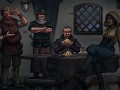
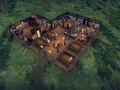
Welcome back to the world of Delcrys, where Crossroads Inn 2, an engrossing real-time management simulation game, takes place. As an innkeeper, face the thrilling challenges of running your inn, managing your staff, devising menus, and satisfying the needs of a diverse range of patrons - from adventurers and nobles to outlaws and the common folk.
However, that’s not all. The world around the inn is alive and ever-changing. There are expeditions, wars, king assassinations, and so on. And while the innkeeper remains in his establishment, it doesn’t mean he can’t influence - on purpose or accidentally… - the grand scheme of things!
But, of course, you can just focus on the idyllic life of an innkeeper… The choice is entirely yours! We invite you to write your own tale and chart your own path across the world of Crossroads Inn 2.
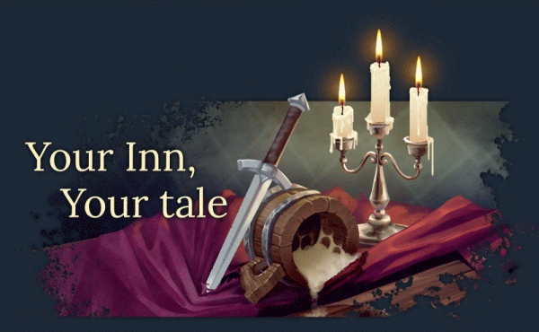
Create your own story through your actions and choices. Your reputation will affect who - and with what business... - comes to your inn. Will you be a timid, simple innkeeper or an entrepreneur whose fame reaches the furthest corners of the world? You decide!
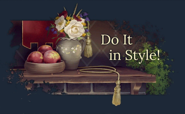
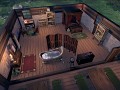
Unleash your inner architect and create your inn the way you want. Furnishing, ornaments; main hall, bedrooms; even your own vegetable patch for the freshest of produce! But remember - different people will react differently to both style and quality of your establishment.
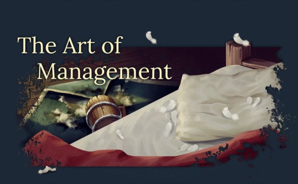
Hire, train, and manage your staff, helping them reach new levels of their skills; create complex menus for even the most fastidious of palates; and cater to the needs of the poor and the rich alike. Eating, drinking, sleeping, partying - who knows what the next patron will want!
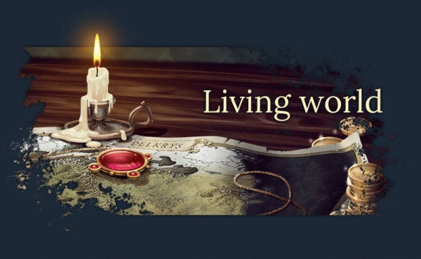
Interact with people from all around the continent and help them with branching, RPG-style quests; poor farmers, investigations into untimely deaths of kings... everyone has a story to tell!
Articles
When we started designing the interface we knew that we needed to improve on the UI from the original game. We wanted it to be more functional and clearer in conveying information and feedback that the player needs. However, we wanted it to retain a Mediaeval-like feeling, so that it remains in line with the game and the general visual aspects of it.
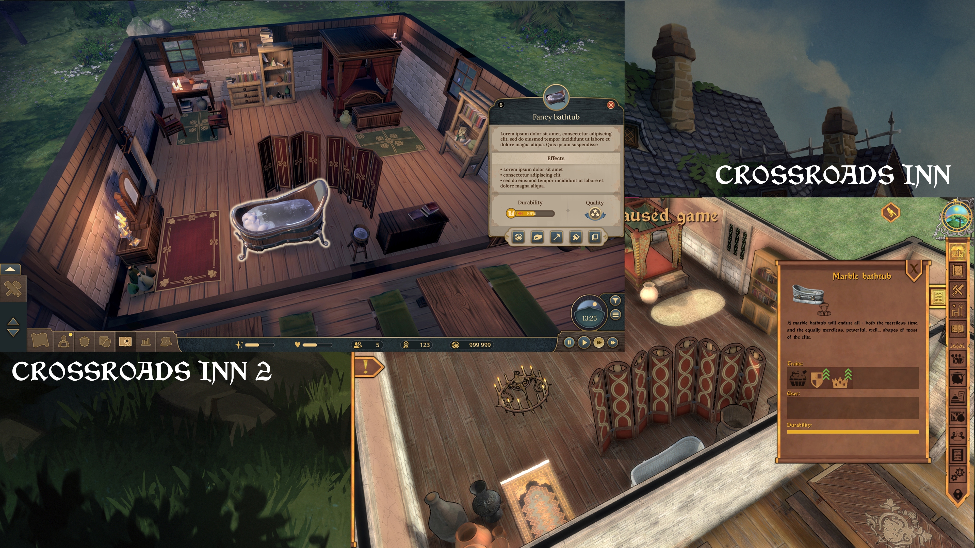
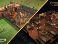
Crossroads Inn vs. Crossroads Inn 2
As you can see, the new UI design is lighter, and smoother, while also being much clearer as to its functionality, details of objects, and so on.
Main Inspirations
As it often happens during a creative process, we went to some of our favourite games to find inspiration for the new UI. First of them was Anno 1800. With its clear division of elements of the UI, it creates a functional system that’s not obscuring the game itself, while the colours, textures, and slight decorations create a visual feeling bringing the setting to life.

While completely different in mood, Two Point Campus is another of our inspirations. The UI is not overly stylized and it conveys all the important feedback and information in a clear way, never leaving the player wondering what exactly is going on and where, how, and what they can do.
Another game worth a mention is The Witcher: Monster Slayer. While it’s a game aimed at a different platform, the use of clearly defined icons and brackets, combined with aptly chosen textures and ornaments, creates a perfectly clear and yet climactic UI.
New Look
There are a couple of things that we wanted to change from the UI design of Crossroads Inn, and one of those is the colours - and textures. We also wanted to avoid design choices typical for most Mediaeval-set games wherein choices of colours and textures create a very heavy and morose atmosphere.
There is no denying that that does fit many games, but in case of Crossroads Inn 2 we wanted the UI to be something that’s pleasing to look at not just within the setting of the game, but also aside from it, for when the player needs to forget for a moment about world immersion and focus on purely managerial, technical, and strategic elements.
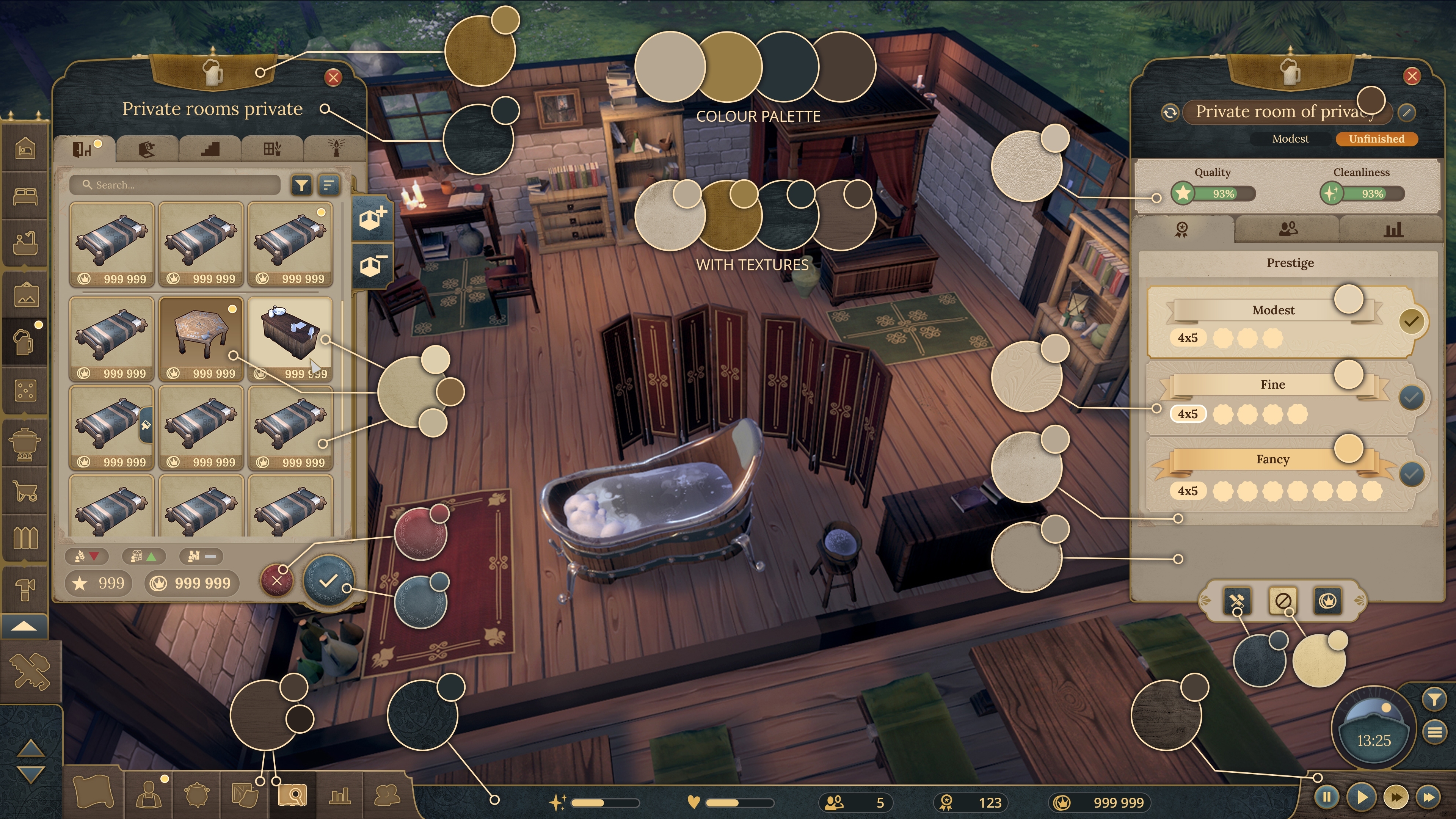
Colour palette and textures.
Of course, keeping the Mediaeval tone of the UI was still very important for us. But to make it lighter, we decided to avoid overabundance of dark colours or metal and stone textures. Instead, we chose beige and dark, navy blue, combined with paper, wood, and textile textures. We’ve also added some Medieval-inspired ornamental patterns to finally achieve a clear, functional, but also era-appropriate UI.
And, since the art direction is overseeing UI, 2D, and 3D graphics, it all fits together nicely, having been designed together simultaneously from the start.
Functionality
Taking into consideration all that we’ve learned from Crossroads Inn, and with new people on the team bringing new ideas, we’ve decided to step away from the UI of the original game which seemingly favoured visuals over functionality. The visuals themselves also did not fit our vision for Crossroads Inn 2, so, in the end, we went in a completely different direction, creating a much clearer UI that makes the navigation much easier, while making the visuals equally stylized, but in a more complex fashion.

Devblog #1: UI and UXLet's talk about goals and inspiration for UI/UX design in Crossroads 2. Hi Folks! It's been a while since the announcement and we're ready to share some new details about the sequel to Crossroads Inn!
In today’s dev blog, we’d like to share the main goals and inspirations for the UI/UX design in Crossroads 2.
When we started designing the interface we knew that we needed to improve on the UI from the original game. We wanted it to be more functional and clearer in conveying information and feedback that the player needs. However, we wanted it to retain a Mediaeval-like feeling, so that it remains in line with the game and the general visual aspects of it.
 Crossroads Inn vs. Crossroads Inn 2
As you can see, the new UI design is lighter, and smoother, while also being much clearer as to its functionality, details of objects, and so on.
Main Inspirations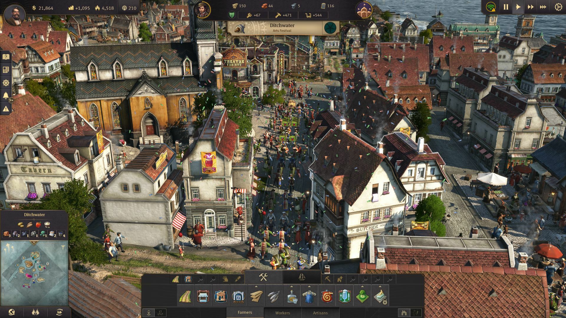
As it often happens during a creative process, we went to some of our favourite games to find inspiration for the new UI. First of them was Anno 1800. With its clear division of elements of the UI, it creates a functional system that’s not obscuring the game itself, while the colours, textures, and slight decorations create a visual feeling bringing the setting to life.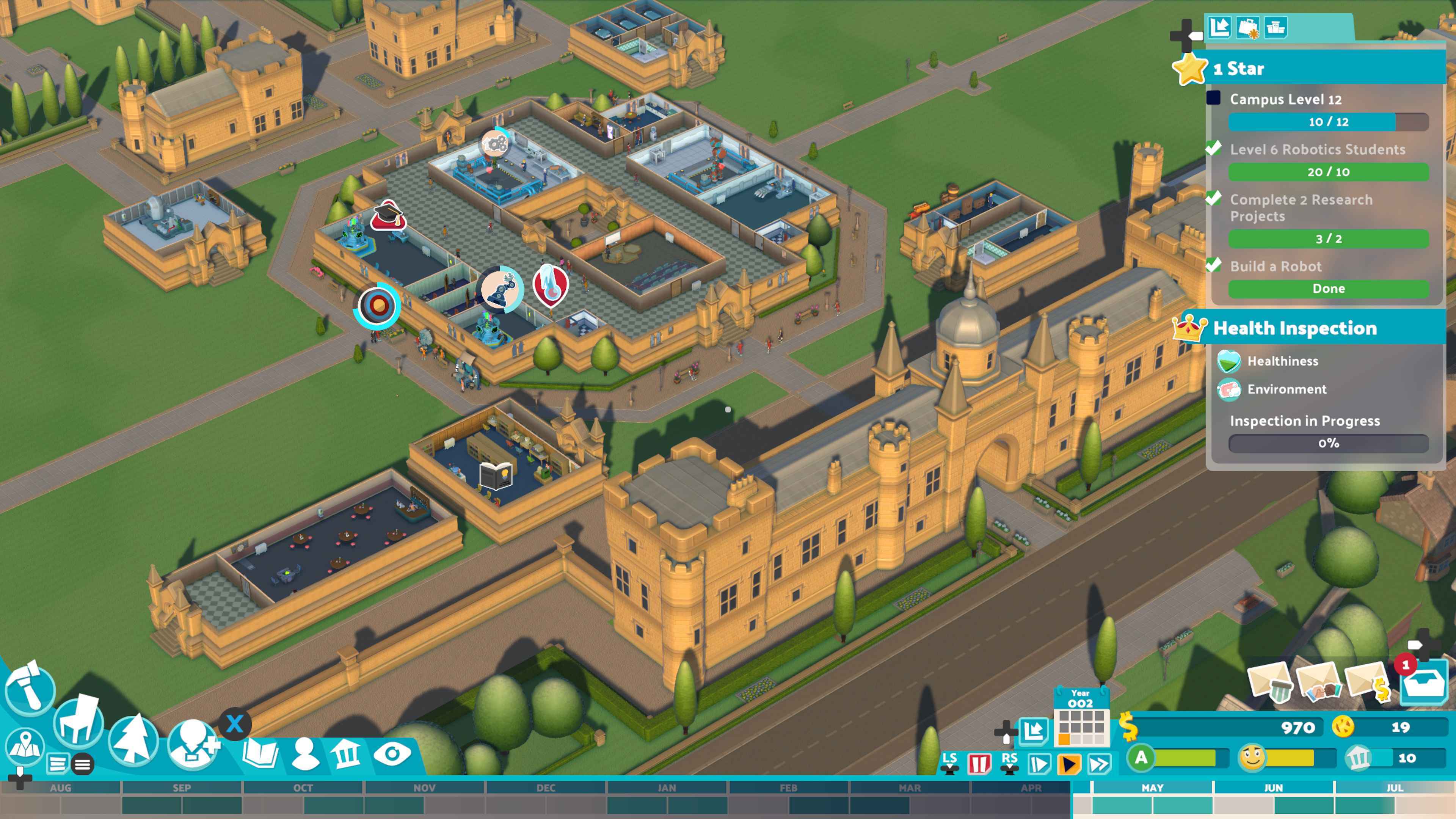
While completely different in mood, Two Point Campus is another of our inspirations. The UI is not overly stylized and it conveys all the important feedback and information in a clear way, never leaving the player wondering what exactly is going on and where, how, and what they can do.
Another game worth a mention is The Witcher: Monster Slayer. While it’s a game aimed at a different platform, the use of clearly defined icons and brackets, combined with aptly chosen textures and ornaments, creates a perfectly clear and yet climactic UI.
New Look
There are a couple of things that we wanted to change from the UI design of Crossroads Inn, and one of those is the colours - and textures. We also wanted to avoid design choices typical for most Mediaeval-set games wherein choices of colours and textures create a very heavy and morose atmosphere.
There is no denying that that does fit many games, but in case of Crossroads Inn 2 we wanted the UI to be something that’s pleasing to look at not just within the setting of the game, but also aside from it, for when the player needs to forget for a moment about world immersion and focus on purely managerial, technical, and strategic elements.

Colour palette and textures.
Of course, keeping the Mediaeval tone of the UI was still very important for us. But to make it lighter, we decided to avoid overabundance of dark colours or metal and stone textures. Instead, we chose beige and dark, navy blue, combined with paper, wood, and textile textures. We’ve also added some Medieval-inspired ornamental patterns to finally achieve a clear, functional, but also era-appropriate UI.
And, since the art direction is overseeing UI, 2D, and 3D graphics, it all fits together nicely, having been designed together simultaneously from the start.
Functionality
Taking into consideration all that we’ve learned from Crossroads Inn, and with new people on the team bringing new ideas, we’ve decided to step away from the UI of the original game which seemingly favoured visuals over functionality. The visuals themselves also did not fit our vision for Crossroads Inn 2, so, in the end, we went in a completely different direction, creating a much clearer UI that makes the navigation much easier, while making the visuals equally stylized, but in a more complex fashion.
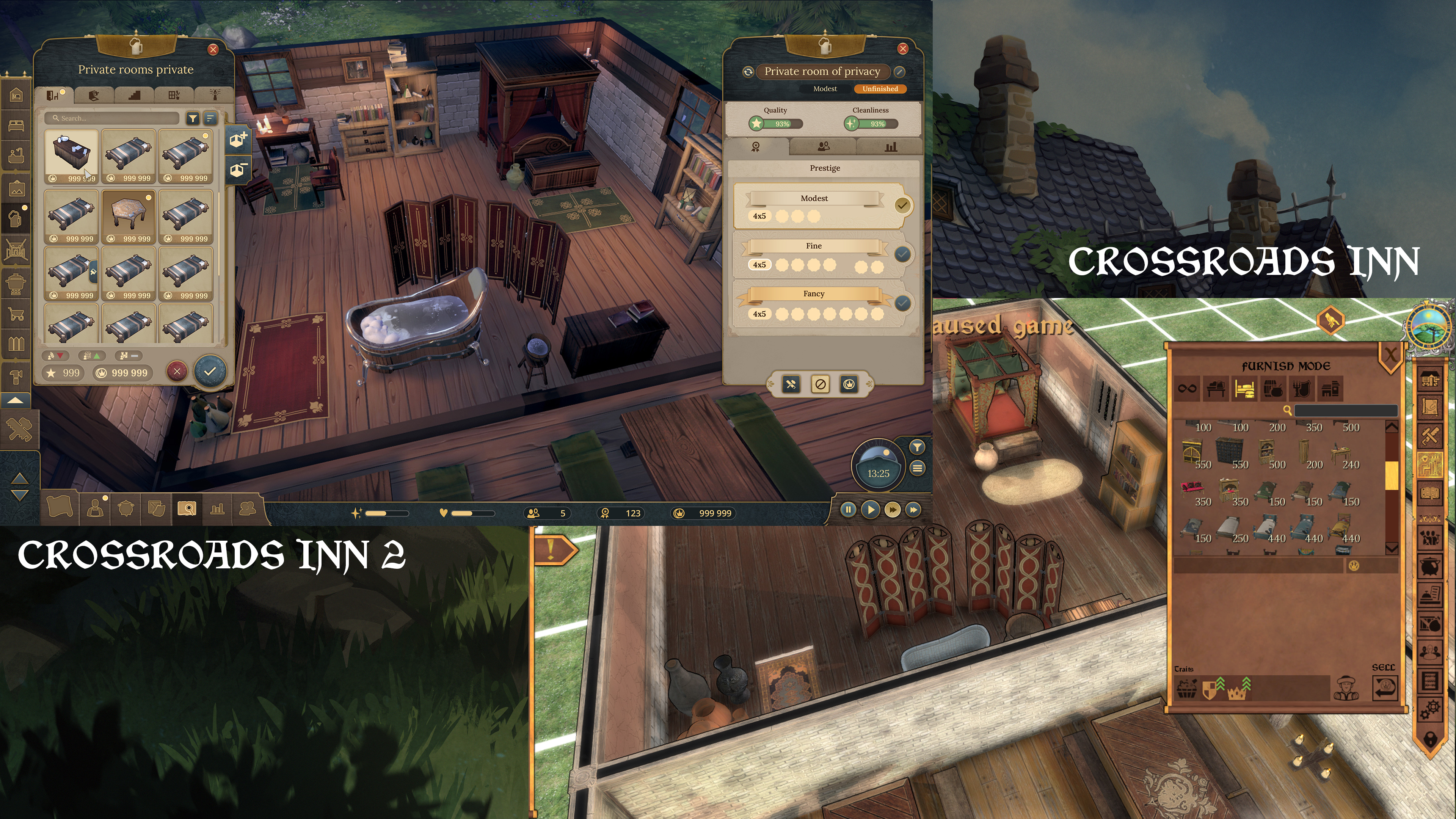
Placing furniture in Crossroads Inn and Crossroads Inn 2.
As you can see, the UI is much clearer, while also offering much more data and feedback to the player.
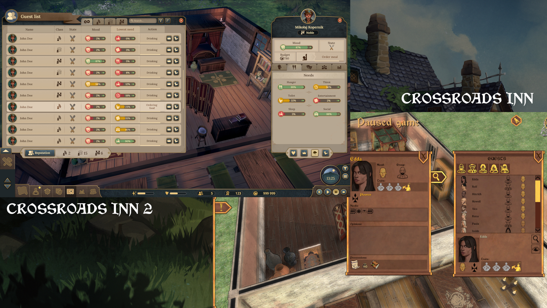
Guest list and guest details in Crossroads Inn and Crossroads Inn 2.
Aside from offering more information, the design ideas behind the new UI included avoiding creating empty spaces often present in the UI windows from the first game.
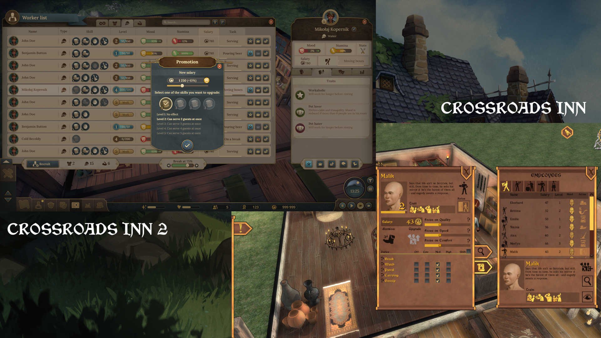
Worker list and details (and worker promotion window) in Crossroads Inn and Crossroads Inn 2.
As it’s been said - more details, more data, everything much clearer.
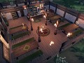
And last, but not least: event windows:
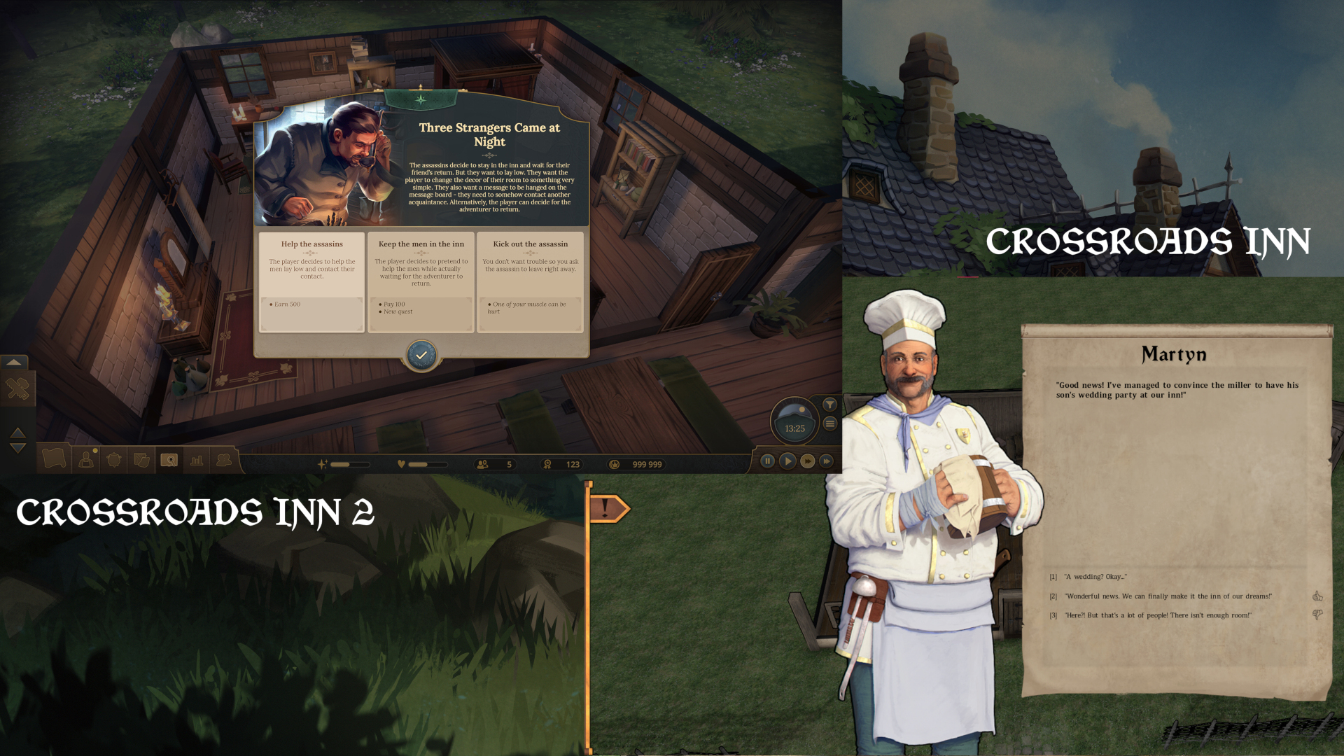
Crossroads Inn and Crossroads Inn 2 events.
Again - less empty space, clearer, and stylistically pleasing.
Art Direction
According to Maja, our Art Director, the aim of the design team and the art direction is ‘to create a unified but unique feeling of all the artistic aspects of the game - UI, 3D assets, and 2D illustrations. We are trying to find a sweet spot between the gray and grim medieval world and colorful and free realm of fantasy.’
Thanks to this clear vision, Crossroads Inn 2’s visuals are all working in tandem, bringing to life the same vision of the world, no matter if it’s through the guests that arrive in the inn, the graphics representing different elements, or the interface through which the player navigates.
…and that’s it for today’s blog! Thank you for reading and if you have any questions, feedback, or opinions, we’ll be thrilled to read them. The comments section belongs to you!
FAQ:
Question: Is the new system going to be more responsive than in the previous game?
Answer: Yes, one of our main goals was to make the UI clear and intuitive, while also providing the player with all the feedback they may need.
Question: Have you improved the readability of text from the original Crossroads Inn?
Answer: Yes, it was one of the more important items on our Fix-It list, since it is a management game with narrative elements, meaning the player needs all the information and feedback served in the most coherent way possible.
Be sure to add the game to your WISHLIST: Store.steampowered.com
Join us on Discord where you can ask devs directly about Crossroads Inn 2: Discord.gg
Post a comment
Profile
Icon
Platforms
WindowsDeveloper & Publisher
KlabaterEngine
UnityContact
Send MessageHomepage
Crossroadsinngame.comRelease date
Game watch
Follow
Purchase

Series
Crossroads Inn
Real Time Strategy
Crossroads Inn 2
Real Time Strategy
X
Tags
Embed Buttons
Link to Crossroads Inn 2 by selecting a button and using the embed code provided more...


You may also like
Warlords RTS
Real Time Strategy
Godsworn
Real Time Strategy
The Protectors of Etheria
Real Time Strategy

Oberon's Court
Real Time Strategy
We. The Revolution
Real Time Strategy
Driftland: The Magic Revival
Real Time Strategy