Hi, IndieDB community we are RockSlide.
Welcome to our third article about Stone Age Warriors, our new game.
Today we bring you a small update, our logo.
![]()
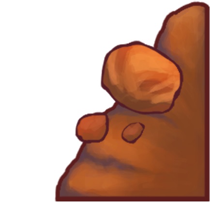
Image 1: Logo sketches
We began by doing quick black and white sketches for the game's logo, either using an imported font or experimenting with drawing the words ourselves.
![]()
Image 2: Color studies
Then, we polished up the sketch that we liked the most (which was the one in the middle), gave it a little color, and cleaned it up.
Then we did some color studies and refined the design even more by adding volume to the words and subtle color gradients.
![]()
Image 3: Tweaked version
After receiving some feedback, we decided to do a new set of sketches to find a way to include the rope in the logo design since that is one of the selling points of our game. In the end, we found a way to include the rope, and we also split the word ‘warriors' in half as if it were playing tug of war.
![]()
Image 4: Logo sketches 2
After some exploration and iteration, we have reached a decision on our logo. We considered various design concepts, color palettes, and typography options to ensure that our logo captured the essence of our game.
![]()
Image 5: Final logo
That is all I have for you guys today.
Have a nice week!
RockSlide Studios
See you in the next post