Hello there!
We have the last improvements on the Logo and general UI of Swing to the Top for the release of the vertical slice.
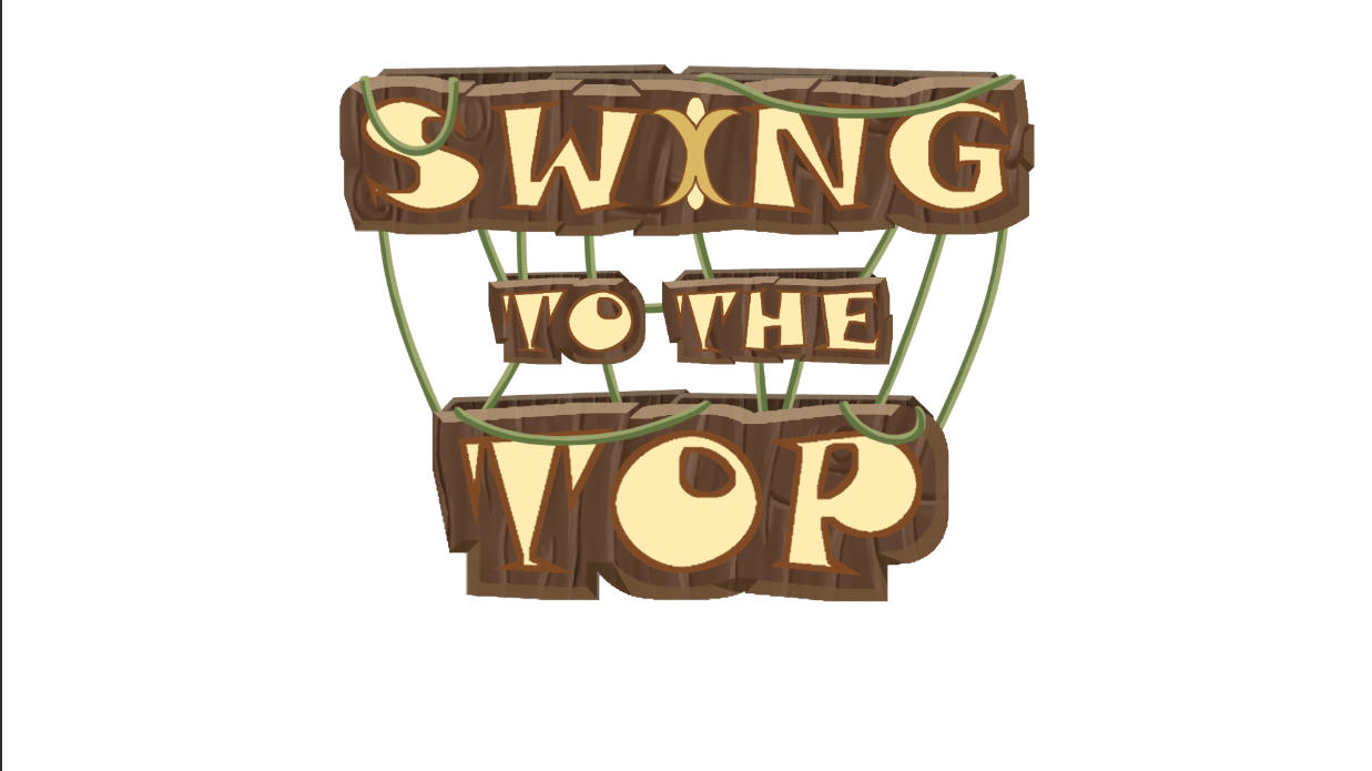
Image 1: Jungle Race logo.
Following the sketches for the logo that we do the last time, we make this improved version. When we see this version of the logo with the rest of the UI and the rest of the game, we started to dislike this logo every time more. So we end up using this version more as a base for the final result.

Image 1: Jungle Race logo.
So this is the final version. It is pretty similar to the last one, but we change the font completely in order to match with the rest of the UI, also use the monkey head as part of the logo and use a better coloring so it can really stand out.
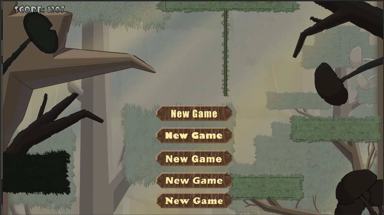
Image 1: Jungle Race logo.
For the rest of the UI we do a lot of text with various fonts. We were looking for a "cartoonish" or "goofy" font, at the same time that it needed to be simple and readable, both for the titles and the normal texts. We do some tests with the colors, but in general we where looking for yellow-orange colors.
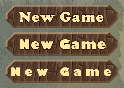
Image 1: Jungle Race logo.
When we started testing these two fonts, we started testing the spacing between the letters and the colors of the fill and outline.

Image 1: Jungle Race logo.
This is the final result. Also, as you can see we decided to make only a settings page with the possibility to change music and sound fx. Also a brief explanation of the controls since they are pretty simple, so there's no need to put them constantly on the game screen.
These were the little advances until the delivery of the vertical slice the next week, so see you soon!
Have a nice week!
Burning Crusaders Studio