Hello,
The logo is such an important aspect that helps identifying anything and this week our game logo as been improved, so we decided to show a little bit of all the ideas along this process.
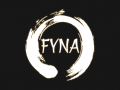
Final Logo

The final logo was chosen having in mind the meaning behind it, since it expresses the best the idea of the shield through the Japanese Ink Brush circle, a font that resembles the Japanese traditional writing and the color palette with the glow effect inspired in the Spiritual World of the game.
The amount of work that we ended up with until the final version of the logo is just amazing, seriously there are so many studies that I don’t even know where to start with, so I’ll just resume this blog to the process of the two final ones that we ended up having to choose between, in the final stage.
Cherry Blossom
![]()
Process
Initial Concept


Different Colors


Proceeded to search and explore different fonts, more alike with the traditional Japanese brush calligraphy, that would match with the color and petals layout chosen.

Different Petals Layout


Different Effects and Colors
![]()
![]()
![]()
Shield
Process
Japanese Ink Concept

Different Effects and Colors


Proceeded to search and explore different fonts, more alike with the traditional Japanese brush calligraphy, that would match with the shape chosen.
![]()
Feel free to follow the progress in our Game Dev Blog, or Twitter (Twitter.com)!

google the AMD RYZEN logo