"The Search For Time"
Hello, indieDB Community!
We are the OddGeckoStudios, a Portuguese game developers team, and welcome to our 4th Devlog!
If you miss our last article on IndieDB you can check it here.
This week we want to show you the Mockup updates of "The Search For Time"
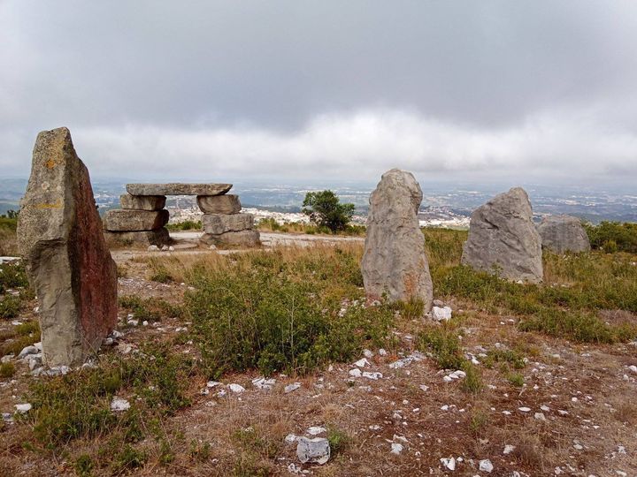
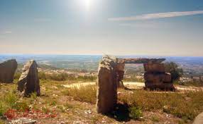
To make the mockup we first choose a scenery in-game with the main character ( Ricky ) in it. That scenery is the "Miradouro", a place that Ricky needs to pass through in order to get to Grandpa's memory box.
(Miradouro)
/
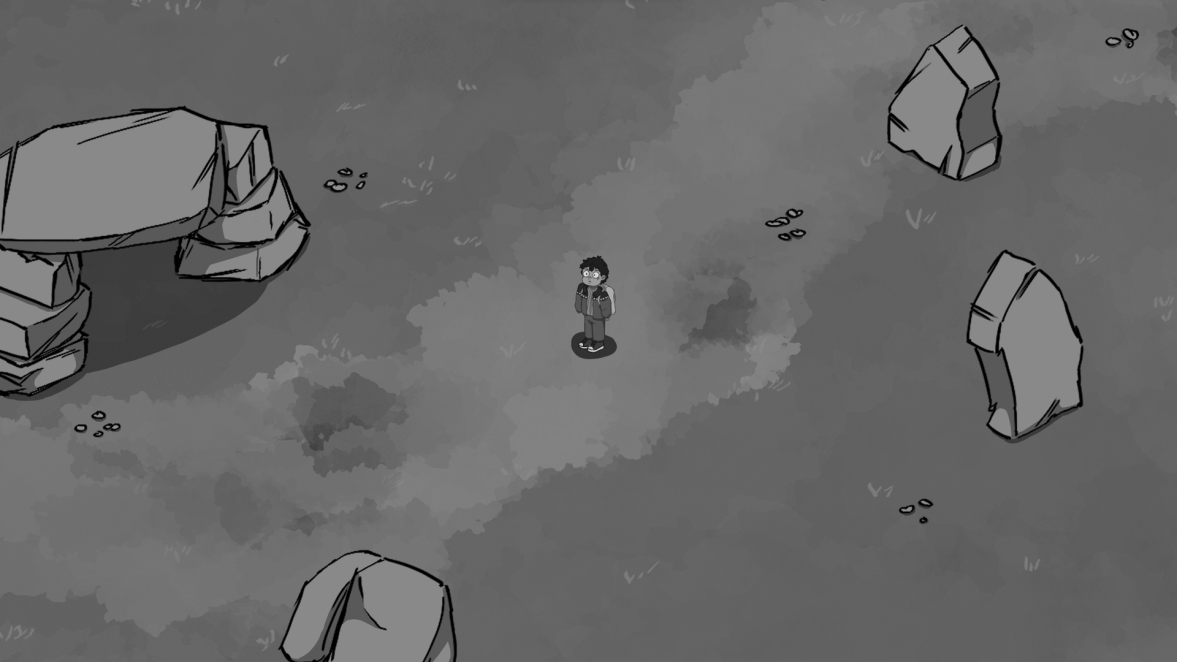
With this in mind, the artist started to make the first sketches of the mockup, with those big rocks around the main character.
First Mockup ( In Grey tones )
First Mockup ( Painted )
After these results, we were pretty happy with the mockup in general, but there were a few things to improve, like the contrast of "Ricky" should be bigger than the Rocks. Because he is the center of attention.
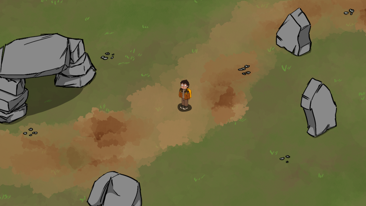
So the artist improved the contrast of the mockup and also added the UI for the game.
Final Mockup ( In Grey tones)

Now the Big Rocks have less contrast, and Ricky has more contrast. Wich improves a lot the view of the game.
Final mockup Colored - Version 1

Final Mockup Colored - Version 2
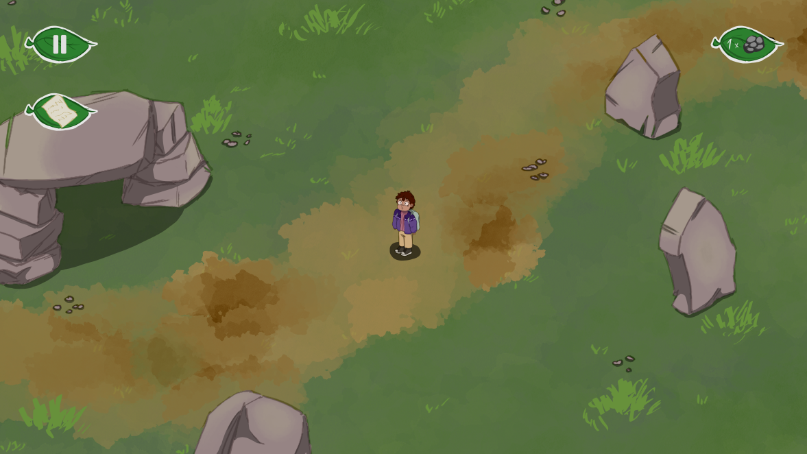
In terms of UI, we have:
- Pause Button ( on the upper left Corner )
- Letter ( on the upper left Corner )
- Amount of rocks collected ( on the upper right Corner )
All of the UI will be explained in the next articles, so be sure to stay tuned!!
From the 2 colored final mockups, tell us in the comments which one you liked the most! We will have that in consideration for our game!
Conclusion
You now have an idea of how our game is going to look. Wait until the next articles to see, UI, level-first playable prototype, and more!
That is all for this week, Thank you!
See you next time!
![]()
OddGeckoStudios


Which mockup do you prefer? Version 1 or 2?