Introduction
Hello, IndieDB community !
Welcome to our eleventh article of our game: “Bracara Augusta: Shadow of the Past”. Today we are going to talk about our game's menu design.
Main Menu
Since our game was about a Roman civilization, we thought it would be interesting to have that characterization in our menus.
Looking at our main menu prototype, we can see that we have four major buttons and the instructions n the bottom.
In the first attempts we made a normal menu and when the player would select the button, this would become highlighted. But it was to generic.
So, we added some Roman decoration on the sides of the buttons, but it was not enough
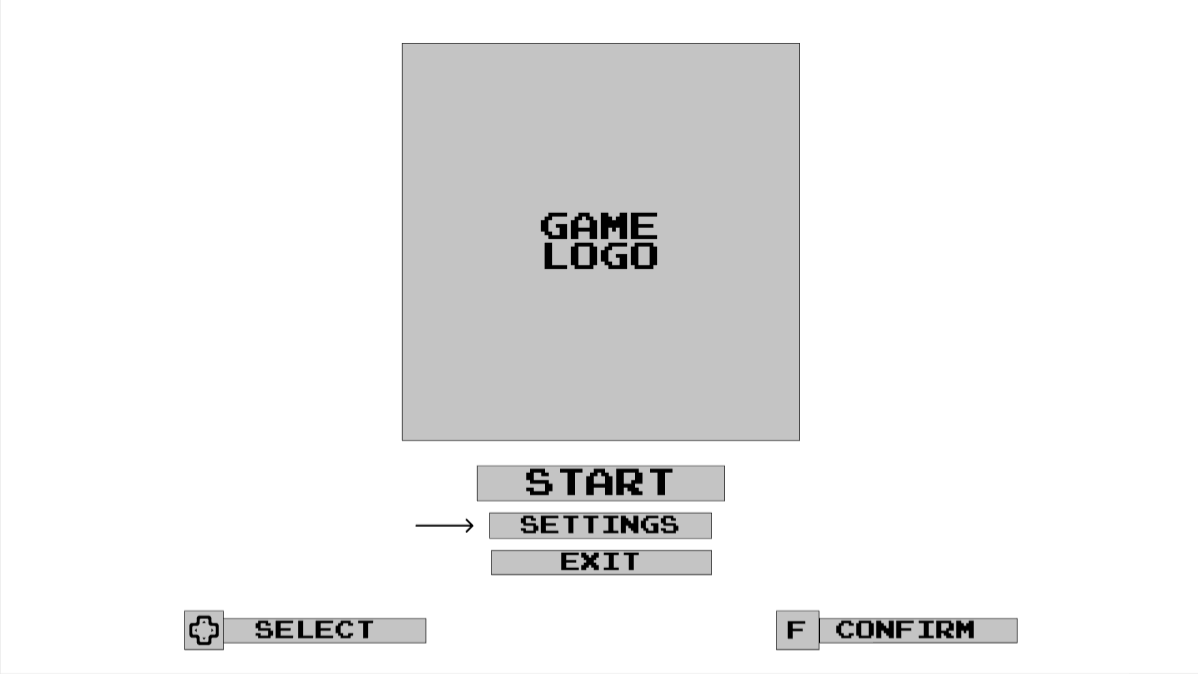
Image 1: Main Menu prototype
![]()
Image 2: Button version 1
After some thinking, we decided to make the main menu look like a Roman temple.
The font used in the final version is Litter Lover by jeti.
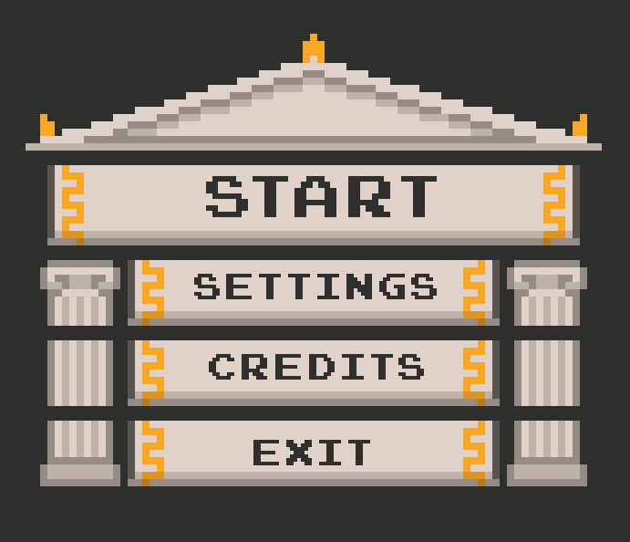
Image 3: Main Menu version 1
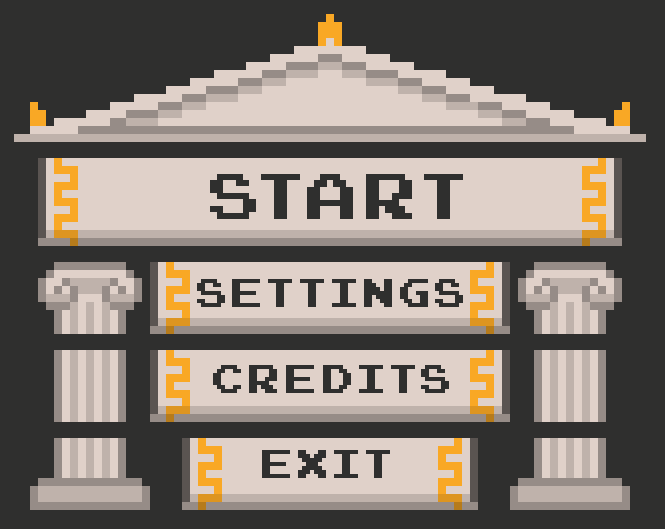
Image 4: Main Menu version 2
After some feedback in our twitter we decided to make a mix of these two versions and change the font. The START button become the same as the other because in the other versions it seemed a bit weird and out of place.
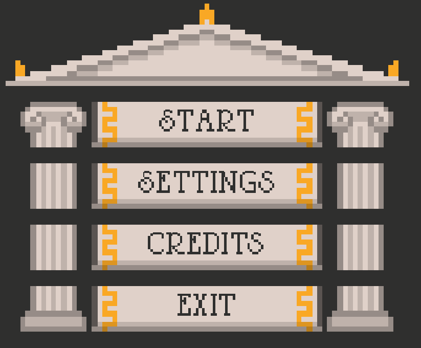
Image 5: Main Menu final version
Pause Menu
For the pause screen, we wanted to use similar buttons but, at the same time, create a interesting window, since in the prototype, the buttons are above a grey rectangle that says pause.
We choose to make the window like a scroll, to look like the character is stopped and reading the scroll.
In the first versions the font and buttons were too big and a bit messy.
After some tries we reached a more elegant solution.
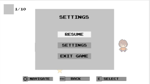
Image 6: Pause Menu prototype
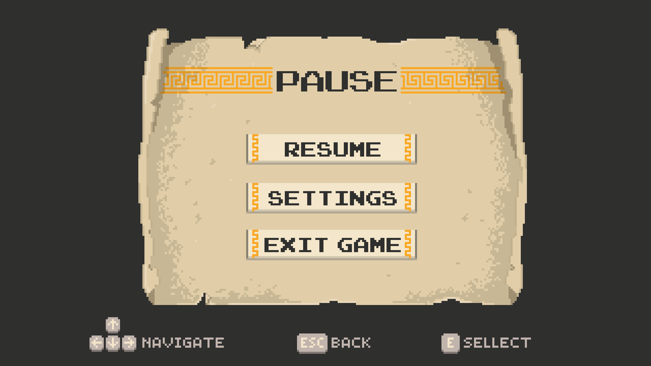
Image 7: Pause Menu version 1
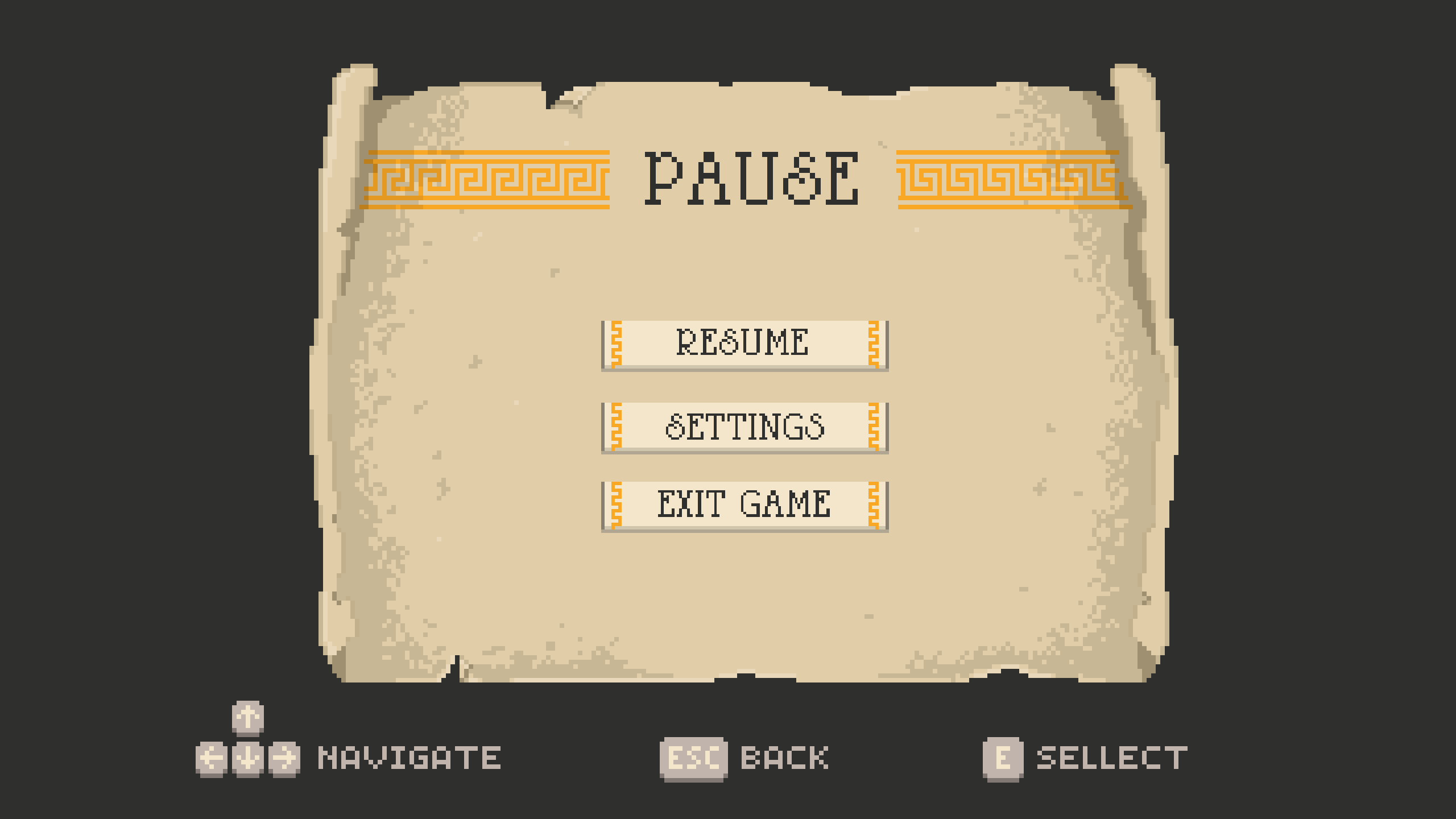
Image 8: Pause Menu version 2
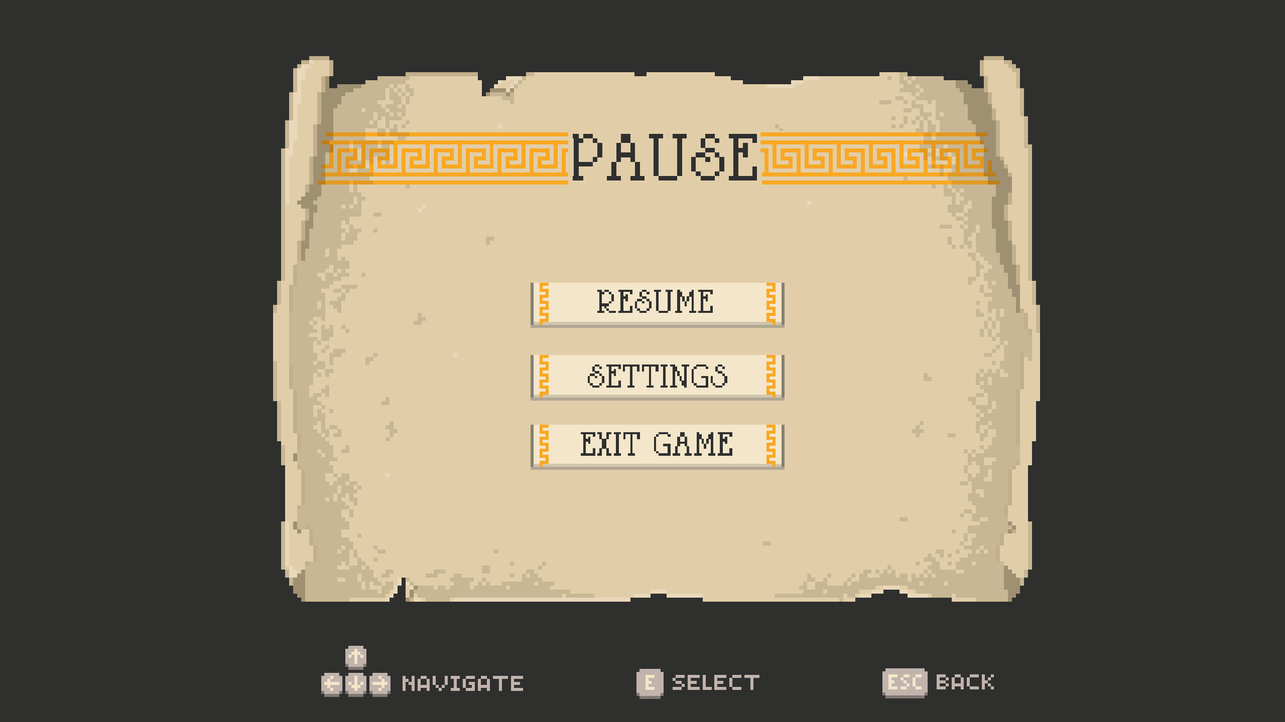
Image 9: Pause Menu final version
To summarize, this week we were focused on creating the UI screens and icons. We are currently working on the rest of the UI screens and animations.
But we will leave that for another article, in the meantime:
