One of the negative comments we get about the game is around the artwork. It's not "bad", it's just stock RPGMaker art - which is immediately noticeable to anyone who's used the tool.
... And anyone who's played the game for more than 5 minutes realizes it's anything BUT a standard RPGMaker game.
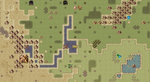
So, we wanted to invoke more of a "map" feel to the overland graphics. Very simply we would apply a filter and mute some of the colors to achieve something like this effect:
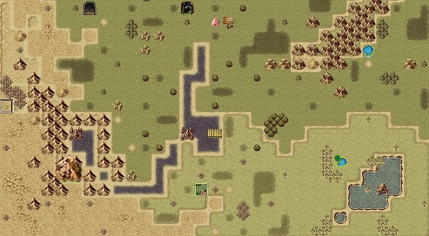
Here's the 2nd try with this method, a tad more muted/darker:
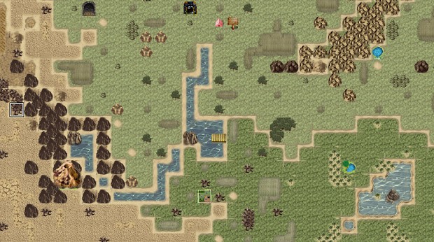
And here's the same sort of thing with some of the new tileset art we commissioned, but are still working on the best way to integrate:
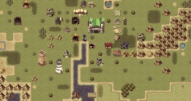
In addition to the terrain tilesets, we also commissioned plenty of new buildings. We want the buildings to show progression. Here's a small preview of some of the buildings (obviously, some clipping & alignment still needs to be done):
We plan to hold another Kickstarter in the next few months to round-out this art (and MUCH more), so stay tuned for more updates!