Eight Ways to Improve Your Pixel Art Characters
Lessons Gleaned from Ben Chandler
Greetings all! A quick self introduction: My name is Daniel Burke, and I’m the developer of an upcoming indie title called Innkeep. It’s a game where you, yes, get to be an Innkeeper, doing regular Innkeeper-ish things. Stuff like: serving beer, charming your guests, eavesdropping on conversations, stealing things, uncovering ancient conspiracies, summoning demons from the planes of hell… In my totally not biased opinion, I think it’s going to be a great game, and you’ll have a heck of a time with it. So, why not wishlist it today?
Anyway, as the title suggests, this is a post about pixel art. Presumably you, dear reader, are interested in learning a thing or two about it. Well, good news. I’m going to share 8 tangible lessons you can take with you for improving your own work.
(Incidentally, you can also read this article over on my website if that's more comfortable.)
But before I get to those lessons, I wanted to talk a little bit about skill acquisition in general, and then about my own pixel art journey. Let’s set the scene.
Getting Better at Stuff
I’ve been getting more into cooking the past couple of years, and I’m particularly enjoying the Pro Home Cooks channel on YouTube. The host, Mike, is good at demystifying what goes into simple, good cooking, and providing basic tips on how to up your game. One really important piece of advice he gives is simply this: Pay attention.
When something turns out well, think about it. Why did it work? When something goes badly, think about it too. What isn’t quite right about it? When you go and eat a good meal at a restaurant, maybe try to analyze it a little bit and learn from it. It’s good advice. And it’s going to be applicable to learning almost any skill.
Check out Mike’s video “10 Cooking Skills I Wish I Had Known.”
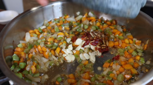
One good example from cooking is caramelizing aromatics like onions and garlic when you are going to make a sauce. This is a pretty basic skill that I thought I effectively knew all there was to know about. Wrong! Turns out you can improve your caramelization technique a lot if you learn some patience, lower the temperature, and really _wait_ longer (like 20 minutes or more!) The flavors will intensify. I never knew this, because at a certain point I just stopped paying attention.
And this is pretty understandable. As creatures of habit, we tend to stick to what we are familiar with. There’s so many discrete skills we have to learn in life, and we are almost always learning new ones or making slight adjustments to ones we already know, subconsciously if you will. If we were continually paying conscious attention to them all we would hardly be able to cope. So once we hit a certain level of proficiency, then on goes the auto-pilot. We zone out. We conserve our mental energy. I wasn’t trying to -get better- at cooking, I was just getting my meals made. Yes, even in this state, we still get a bit better. But it can be a lot, lot slower. And so we plateau. We can cook all our lives but still be a pretty bad cook. Because we don’t actually try to convert our experiences into lessons.
The same of course goes for pixel art. (Segue achieved!)
My Pixel Art Journey
When I first started prototyping Innkeep all the way back in 2015, I had effectively no experience with art in general, let alone pixel art. But I needed some sprites to attach to my objects, so I put something together that looked like this:

OK, so I wasn’t _really_ trying to make something that looked good. Just something suitably evocative of an innkeeper for the sake of a prototype. But just to set some context. This was me figuring out basic things like how to use software for selecting colors, how to fill areas, etc. It might look terrible, but in terms of progress it was already a big jump up from “no skill”.
A year and a bit later, and I was pretty happy with the prototype. So I tried to start converting a lot of my art into something more closely approximating actual pixel art.
There are so many discrete skills here that I was -starting- to try to figure out. Stuff like:
- Perspective (turning them slightly so they aren’t facing directly forward).
- How light might hit somewhere more and make it brighter.
- How to pose a character (arms that rest somewhere).
- How to show folds in clothing.
- How to make hair look textured and not flat.
- How to get some geometry into the face (using lighting).
Etc. etc. If you think about it, there are so many individual skills that need to be acquired at a rudimentary level to even begin to make a piece of pixel art that looks pretty bad, rather than absolutely beginner stuff.
Eventually I felt I could manage something a little bit nicer. And I wanted to try some animation.
Having to animate a character taught me a lot. This video game format has fundamentally shaped how pixel art looks. Not only in terms of old hardware limiting the number of pixels in a sprite in the past, but in terms of things like the demand placed on the medium by the need to animate it, and then have it remain visually understandable.
For example, you need to simplify the color palette if you want to have animation not take forever. But you also want simple, distinct colors so that the movement is “readable” even when the character is quite small (the above sprite is much smaller when viewed in game). I should note that I did go and -look- at other pixel art at this time to help me get some idea. But I never did anything as thorough as watch a lot of tutorials on Youtube (which would have been a good idea, although there was not quite as much of that stuff around five years ago as there is now.)
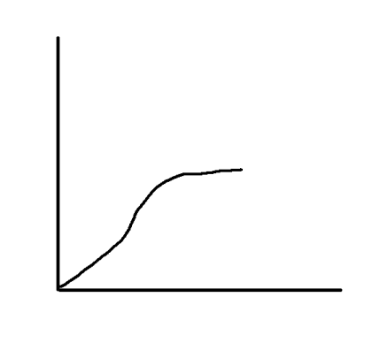
So, at this point I was feeling pretty good about my progress. I was getting better every year, and now I felt like my pixel art was “good enough” to be something worth animating.
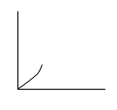
You can imagine the axis labels yourself. 😉
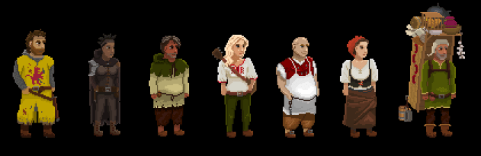
I went on from there to create quite a few characters. Here’s some of them. This was around five years ago. 😉
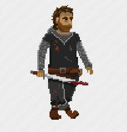
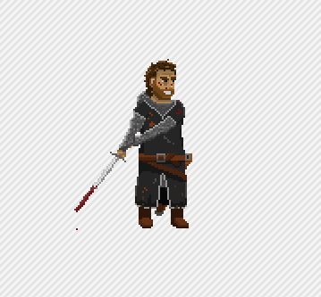
Over the following years I kept making more, and them some animations as well. Here’s a mercenary captain.
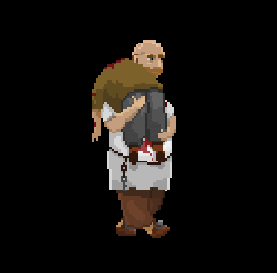
And here’s the player character. Carrying a body. You might combine these two images to picture something of the Innkeep story. 😉
I was quite happy with these sprites initially, because they did represent a big leap from where I was starting out. But once I started to focus more on animation and other aspects of the project, I ended up stepping away from actually looking at other pixel art in more detail. It’s that auto-pilot stage I mentioned at the start. So although I continued to produce pixel art, it didn’t really get much better. My skill growth had plateaued.
Here’s a completely unnecessary representation of said plateau because
it feels good to break text up with pictures. 😉
What forced me to start looking at my pixel art again was a new hurdle: Creating trailers for my game. This was an interesting skill to learn, and it was fun showing my game to large numbers of people through events like Realms Deep. But it also made me look at the visual presentation of the game more critically. I knew that one of the areas I needed to focus on was the pixel art.
I was also finally getting to a point in the development of the game where more animation needed to be added. If I was to change the overall look / quality of the pixel art, it had to happen before I went too much further with animation, as every re-design meant re-doing the animations that already existed.
I need to do this again. Bleh.
I wasn’t quite sure where to start when it came to bringing my art up to the next level. Fortunately, I was able to commission an experienced artist I knew who could help me out on this front: Ben Chandler. You might be familiar with his art from Wadjet Eye games like Unavowed.
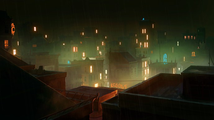
(Ben has been working on a series of amazing background pieces recently, for a game called Nighthawks.)
Ben has been a great help with a number of tricky pieces I was struggling with. There’s nothing quite like seeing an experienced person take something you did, and then make it good. It really helped me to pay attention, so that I could draw some lessons from changes that I could see, and learn how to do a better job myself in the future. I can’t exactly reproduce that experience for you here today (because you didn’t make the original art), but I can approximate it by showing you before/after pictures of some characters he worked on, and focus on what changed.
Quick aside: I want to point out here that I was able to commission Ben thanks to the help of my amazing Patreon Supporters. Over the years I have been able to get a lot of nice pieces of art done for Innkeep using their donations. It really has made a big difference. But the game still needs more art. It deserves more. And time that I spend trying to do all the art myself is time away from other parts of the game that are also crying out for attention! If you’d like to see the game come out just that bit sooner, with nicer art, maybe consider supporting me on Patreon too. 😉
Eight Characters, Eight Lessons
So let’s now get into the lessons. We will be looking at eight characters Ben Improved for me (plus a ninth at the end to sum up). For each character I’ll go over one important take away for improving your pixel art.
Lesson One: Contrast. Contrast. Contrast.
Of course, contrast is not only important for the face, but for all of the sprite. Just take a look at the stark difference between these two versions of a bard character called Captain John.
I mean. What a contrast! (Pun intended). It’s not just nicer to look at contrast. It functionally helps to understand the geometry of the character. We see here that Ben put a lot more brightness into the face (more on this below). But we also see greater contrast applied elsewhere. Take a look at the shirt, for example, poking out between the jacket. Or the way the trousers have been made even darker to contrast the lower body with the upper body. Or the way the brim of the hat is a lot brighter.
Zooming in, we can see there really is a heck of a lot of contrast between the left side of the hat, and the brim. Pixel artists have to assume a kind of imaginary light source to achieve this sort of look. Typically, it is above, and maybe slightly to the right, as is the case here. Done well, the player won’t analyze the sprite too much to see if that light “makes sense” with the surroundings. Rather, they appreciate the geometry that is brought into relief by the assumed “baked” light. The takeaway here is that if you want to prevent your sprites from looking flat, you need to start getting braver with the amount of “distance” that exists between your low and high colors.
On the importance of contrast, Ben explained it to me this way:
wp-block-quote wrote:In games, it is particularly, super important for “interactive” elements like characters to contrast well both internally (so eyes from the face) and externally (against the backdrop). Putting a lot of value/hue contrast into your palette immediately and automatically assists with having them stand out from the background, too.
Lesson Two: Make Faces Pop
Contrast is important. But it’s particularly important for faces. Here’s a before / after of an elvish rogue character.
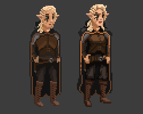
You can see quite a few changes (posture, highlights on the cloak, etc.) One simple lesson here is to lean more into contrast in general (lesson one), making the highlights a lot brighter to stop your art looking flat. But beyond that, the key takeaway is that the face is the most important part of a character sprite. It’s where we will look first. And so it should ideally draw the eye towards it.
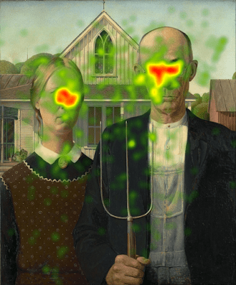
With regards to the importance of the face, Ben pointed this interesting fact out:
There have been actual heatmap studies of people’s experiences of looking at images which show that humans care THE MOST about the person in the picture, and most of all, their face (short version here.)
This looks a bit like modernist art to me.
As discussed with the hat above, pixel art typically imagines light coming from a fixed position located somewhere above a sprite. So from this perspective it also makes sense that the face is going to be the most well lit part of the body.
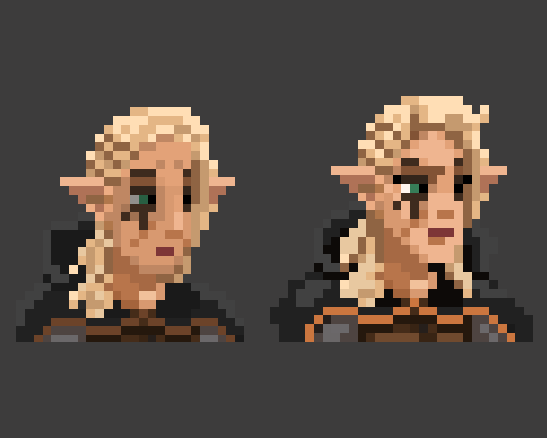
Note that not all the face has gotten brighter. The neck under the chin is still nicely dark, but now the contrast with the face is stronger, helping to give a greater sense of geometry (i.e. it looks less flat).
Ben had something more to say on this subject:
Dark shadows under the neck are a super strong tool not just for giving geometry, and for suggesting light. They also act as a framing device for the face itself.
Lesson Three: Don’t Think of Color Too Literally
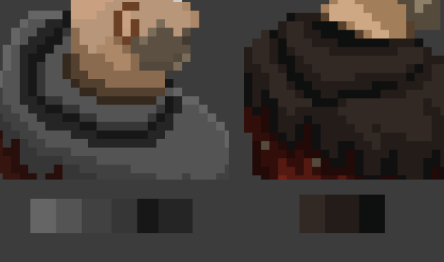
I think there is a tendency for beginner artists like me to be overly literal in our application of color. Take the image of this ruffian below.
The lower edge of the hood casts a shadow over the tunic, but the edge itself is not -darker-, as it is all of the same fabric. But if we look at Ben’s version, he was happy to add a nice darker color there to accentuate where the hood ends and the tunic begins. He did a similar thing with the dark brown lines around the arms.
I think that what we beginners need to unlearn here is the idea that each individual pixel must belong to a specific surface, and therefore have a specific, set color that “makes sense” given that surface. We need to recognize that sometimes a pixel is doing multiple jobs at once. Here, I think of the dark green lower edge of the hood as helping to convey some of the shadow that it casts on the tunic, while functionally also just helping you to see where it ends. Looked at close up, it might not look “realistic”, but looked at from a distance, it’s much easier to “read”.
Here’s a bonus lesson: When working on pixel art, we really need to zoom back out now and then to the “native” resolution of the piece. This will help us to think in more functional terms about our use of color.
Here’s more from Ben on this subject:
Shifting hue & saturation as you move from highlights to shadows can also act as a form of information about our light source – if our lightest tones are warmer and more saturated than our darkest tones, it suggests that the light source is warm like an oil lamp, and the shadows are cooler. If the lightest tones are cooler it suggests a cool light source like a full moon. Also helps increase contrast between shades without having to push the values so far that the characters stop matching the background elements.
Also just having a wide range of colours in your ramp feels mature and controlled, it gives a sense of design, not just “well lights are brighter and shadows are darker”
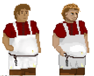
Lesson Four: Keep Your Colors Simple
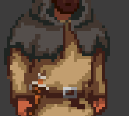
Here’s a mercenary seated at a table (imagine a bench under him, hiding his legs).
I really like what Ben did with the body. Notice how much better the contrast is there with those lush reds (lesson one). And look at how the angle on the body makes a lot more sense now (like shifting the camera downwards a bit). But what I want to focus on in particular here is the neck area.
Notice how many more colors I was using for the hood? Ben reduced them by half! There is a tendency with beginner pixel artists like myself to just try adding -more- detail, as though more is going to mean better. And yes, overall we do want a bit of color variation to help secure contrast. At a certain point though we need to appreciate that often less really is more. The attention should always be on securing a clear form, with the minimum amount of necessary color to achieve that.
On this topic Ben points out that :
Well designed shapes in your shading feel much more informative and like “actual detail” than a smooth gradient. The goal in pixel art for me is as much shape information with as few colours as possible. Pixel artists often refer to this process as designing “clusters”.
The way I understand this concept is that using simple clusters with restricted amounts of color makes the sprite easier for the player to “read” on the screen. In this example, I had a lot of color variation, and it was all subtle shades of gray. Let’s take another look at that hat from earlier.
Again, we have detail, and we have a lot of different colors. But notice that they are spread out over a wider contrast range, and that the detail is not more than it needs to be to help convey the major forms or characteristics of the character’s shape. We have four shades of brown, for a major shape (a hat), rather than the six shades of grey that were muddled together with the old attempt I made at conveying the existence of a hood.
Lesson Five: People Don’t Stand Like Poles
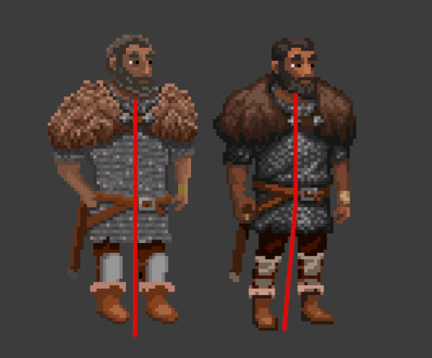
OK, so we know a bit about color now. Time to think about form. Here’s another cool before/after.
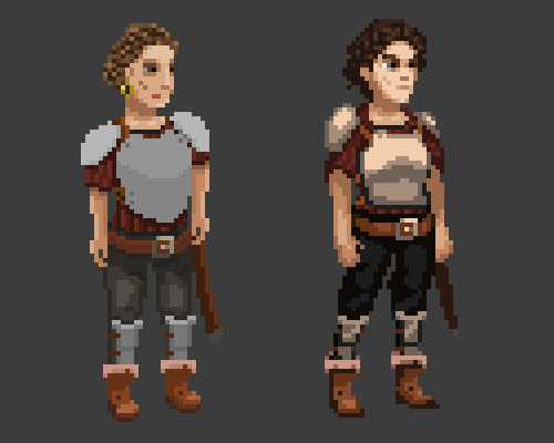
Again, note the increased highlighting on the face, helping it to pop nicely. You can also see a bunch of other improvements I’ll discuss below. But my main focus here is the posture. If we draw an imaginary line for each character’s posture, it might look like this…
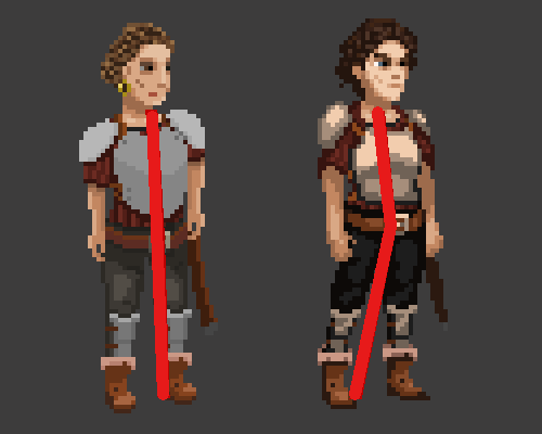
The arm posing here helps a lot, but the leg posing is maybe what generates the biggest difference. Rather than both the legs functioning as vertical poles, we have the front one given a jaunty angle that gives the form a nice slant, which then bends back again at the waist (which you might note has also been raised up a bit to a more natural position). The character feels like they really are “standing”, about the launch into action, rather than like a manikin attached to a rig.
Ben has pointed out that:
A good resource on this one is the concept of contrapposto. I don’t often get to draw characters in fun poses because of the sorts of games I work on. But you can still attempt to do it in subtle ways here. Games like Street Fighter and the like get all the fun haha.
Lesson Six: Angle the Feet
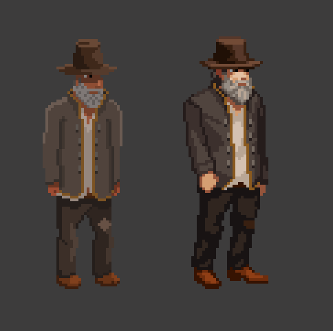
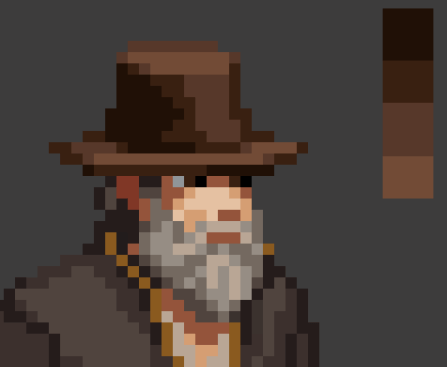
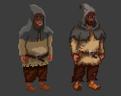
Here’s the Old Innkeeper of the Weary Pilgrim.
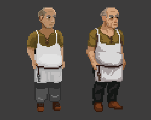
Notice the folding of the cloth (a bit more on that in a moment), and the lovely highlights on the face (lesson two). What I want to draw attention to for this lesson is a simple way to improve the posture of your characters: Bring some contrasting angles into the posing of the feet. A key trick for this kind of pixel art does seem to lie in having a character be both clearly visible (and hence facing the camera) while at the same time appearing to face to one side in profile. The old version of the sprite had his feet angled more or less directly towards the camera. With Ben’s version, we have this more blended approach, with one foot facing more or less front on, while the other faces more or less to the right.
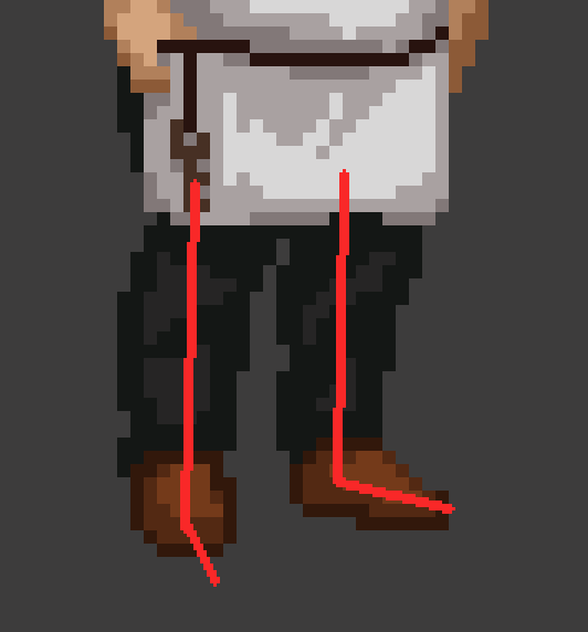
Really, neither foot is entirely facing in either direction, but slightly angled towards a mid-point that is down and to the right. Perfect for helping to blend the two competing requirements for side-visible pixel art.
Ben had this to say about the feet:
Sprites are 2d representations of 3D objects. Most of the human body works pretty well when designed as a flat sprite, but the feet are notably tough because they protrude further than most other parts of the body. This means a lot more work has to be done to make them look convincing because we’re trying to work in elements of perspective and foreshortening as well as just trying to make them nicely designed and shaded.
Lesson Seven: Fabric Has Folds
Next we have a mercenary leader. You’ll get to know him a lot better in the Innkeep prologue.
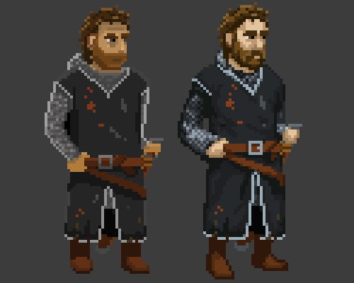
Notice again the highlight work on the face (lesson one), and the way the posture has a subtle bend to it (lesson two). But what I want to focus on here is the cloth. This fellow is wearing a big tabard, so we have quite a bit of cloth. With the original version of the sprite you can see that it looks quite flat. A big difference with Ben’s version is the separation of that flat area into lighter and darker zones, which work to show folds in the cloth. If you look closely, you can see that this is not random: there’s a certain intentionality.
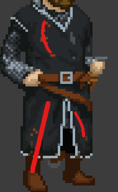
The highlighted parts of the cloth help to accentuate the posture, or rather, are informed by a posture we cannot directly see. It helps us imagine the angle of the legs, and the shape of the chest. Then there is a kind of bulk to the cloth that leads to wrinkles bunching up elsewhere. Importantly, the overall effect is still relatively clean, and hence easy to animate (lesson four).
Ben points out another benefit of using folds in cloth:
Having folds helps large areas of flat colour like a torso also match areas of more intricate detail like the face better, so that the sprite can have a more cohesive look overall.
Lesson Eight: Strike a Pose
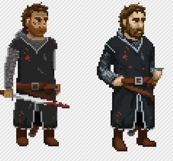
Time for the last lesson: giving our characters interesting poses. Not only can we put our legs at jaunty angles, we can do fun things with arms as well. As you may have noticed from my sprites so far, they all have idle posses where their arms are just hanging down loosely by their sides. But how often do we stand like this in real life? If this base sprite is the default “idle” pose we are going to animate, why not make it a little more interesting, in a way that could convey some of the spirit of the character? Have a look at this swashbuckler.
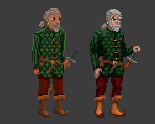
The original version had him grasping the hilt of the sword, but it’s a pretty passive pose. Looking at him, what would you assume about that character’s personality? Does the sword look like it belongs to him? Does he look comfortable in using it? Now consider the same for the new version. Now this is a fellow who looks very adept at sword fighting! Of course, the posture improvements and the facial work all contribute, but just the pose change alone to have the hand resting on the pommel does so much. It’s pretty fascinating! I honestly never would have thought about it.
Summing It All Up
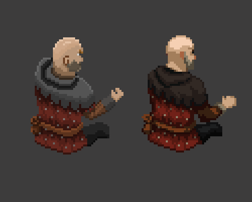
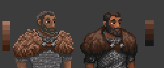
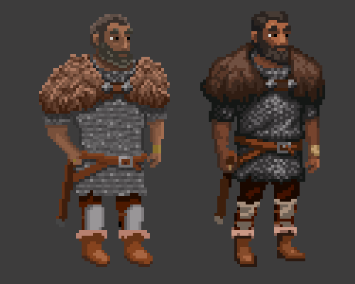
OK. So we’ve looked at our eight pixel art lessons. Let’s do a recap now, and see how all of them are at play in a final, very cool image.

Damn that’s amazing improvement! What has Ben done? Let’s go at it blow by blow, in the order of the lessons given above.
Well, we can see that he brought in more contrast (Lesson One). Overall, there is a lot more dark going on in the piece. This allows for greater variation across the board. I had made an attempt in places to do this (under the bearskin fur, or where the chainmail ends over the legs), but elsewhere any application of contrast was so minimal that the character looks almost entirely 2 dimensional. With Ben’s version we have so much luxurious contrast applied that the whole figure looks like it almost wants to step out of the screen. But it’s not just variation in light and dark, but variation in tone… Take a closer look at the upper half of the sprite and the face.
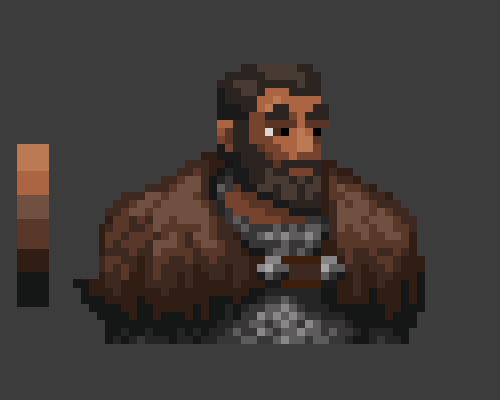
Yes, we have nice dark / light variation. Ben went very close to pitch black for the underneath of the bear fur, while the tip of the nose, hit with direct light, is a lot brighter. But the nose is not only brighter than in the original, but also shifted in tone to bring in more orange. The result of this change is that the face looks a lot warmer and less faded out, and is more visually distinct from the rest of the sprite (lesson two).
Now take a look at the boots for an example of lesson three (not taking color too literally).
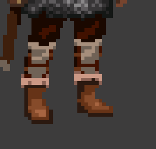
Notice the thick brown lines there running along the side? It’s hard to say that these lines “represent” something like the shadow of the boot, or its darker side. Same with the brown line on the right side of the left boot. But it helps to make the overall shape of the boots more distinct. Up close, yes, it looks a bit strange if we take it literally as representing some material on the boots. But again, we want to look at the sprite from a distance to appreciate the genius of this effect. Here we go…
Now how does it feel? Pretty damn good, right? Remember to zoom out, and think of how the sprite will look at its native, in-game size.
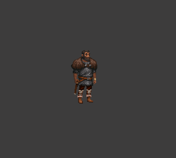
OK. Lesson four was keeping colors simple, and we can see here too that Ben has focused on a few areas to simplify. In particular, the bear skin fur has been significantly improved by reducing the amount of color variation. Take another look of the two sprites along side each other…
While my original fur area had six colors, Ben reduced that down to five. But more importantly, here also increased the color range at the same time. The overall effect is more contrast, with less colors, and a cleaner looking surface that is easier to “read”. The reduction of color is not the only simplification. The amount that the different colors are intermingled has also been drastically reduced, making their relation to each other simpler as well. The eye can more easily tell what it is seeing, which makes it more pleasant to look at.
Lesson five was to get posture flowing more naturally. The difference here is subtle, but again that shift in the stance of the legs really helps to make the character look more grounded (the waist has also been brought up higher to a more natural position.)
Focusing on the boots again, we can also see how the feet in the above image have been angled (lesson six). The right boot (from our perspective) is pointing a bit more to the right, while the left boot is pointing a bit more down and towards the screen.
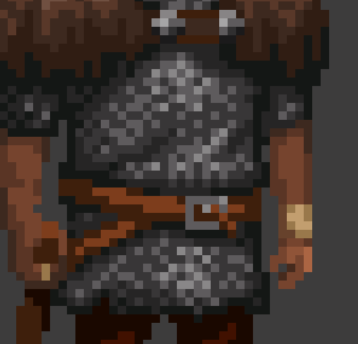
Lesson seven was to add folds to your fabric. Take a look at that chest up close. Notice the way that horizontal brighter and darker lines suggest a bit of bulk to the chainmail that has been cinched with the belt.
Again, let’s zoom back our view and contrast.
The flatness of the original chest area has been fixed not only with more contrast (brighter in middle, darer to sides), but with the addition of these subtle folds. Yes, this would be hard to animate if it had to twist and stretch, but this part of the body is going to be quite stable during any walking animation.
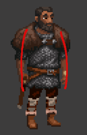
Last, but not least, as per lesson eight, we want to pose our characters in an interesting way (different to posture, which we spoke of above). Here, Ben removed the character’s left (from our perspective) hand from the hip / belt region, and let it hang down. Yes, in this case we actually have a “simple” pose, but it fits with the belt being raised up to a proper height, and the arm getting a decent length to it. I like that there’s a slight curvature to the arms. We get a real impression of strength here. This might not come across as well if the arms just dangled down in straight lines.
And there you have it! Eight lessons and nine characters. Now that you’ve been over all of these improvements, maybe go back and take another look at each of the characters and see if you can spot the different lessons in each before / after image. When you know what to look for they become easier to spot! Good art is a lot of hard work, but it’s also technique. So we need to practice paying attention to what works, and learning from what doesn’t.
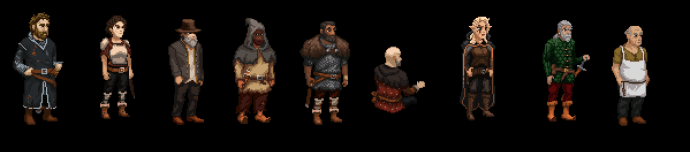 How many of these characters survives the Innkeep prologue? 😉
Thanks for reading all the way to the end! And thank you to my Patreon supporters who helped to make this post possible by funding the art improvements. In particular, I’d really like to say thanks to my current supporters who stuck with me during a slow development period while I was ill.
Silky Paws
Richie Bisso
Eight Bit Vic
Detacroix
Dominik Reichhardt
Euphoric Fox
Browncoat Jayson
Peter Adams
Douglas
Louis Toadvine
Allstreets
Thank you all~! The more help I receive from patrons, the more help I can get from experienced artists like Ben to really make Innkeep shine. Speaking of which, why not also wishlist Innkeep over on Steam?
And if you have any questions about your own pixel art, why not jump on over to our forums and ask? I’m still learning myself, as you know, but I’m happy to share what I do know. 😉
Until next time!
Daniel

Great article. Thanks!
You're welcome! ;-)
Ben's approach to pixel art really gives me that old LucasArts adventure vibes. The colors used really scream 'Full Throttle'.
Very interesting article!
Well spotted. He's a big adventure game fan and works in the space. ;-)