Introduction
Before you read this tutorial/guidebook, I urge you to also read this other tutorial (not by me) at some point. It gives a lot of good information, tips, and pointers on how to make digital art.
Ever since the release of the first computers, digital artwork has been more or less a war for the highest quality pieces. The key to good art is a good program, however, do not feel that a good program is the only way to make good art. In this guide, you will learn how to make pictures that look like they could have been made in a program like Photoshop, but were made in a program like Paint or other less powerful programs.
The Basics of Digital Art
Of digital art, there are many categories. The one we are dealing with most likely in this program is what I call 'pixel graphics'. In other words, instead of dealing with things like Photo Manipulation where you build off of previously existing objects (like a photo), we are most likely making our graphics by hand from scratch (or with a reference). These drawings are often looked down upon by those who paint or do much more complex model-based 'pixel graphics', such as those found most commonly in internet games and high-quality Flash games.
Nevertheless, pixel graphics are actually a great place to start as an artist, because they require the creator to apply real-life knowledge (like what 'brown' looks like in the shade or what pattern woven cotton looks like). You, the creator of graphics, must be able to visualize your work in your mind's eye before building it. I recommend making a drawing with colored pencils and paper before creating the object, or try making it on graph paper with each graph symbolizing a pixel. This will let you prefect what the final project will look like. Also, when working on something, try to find a picture of the object on the internet or use a tangible copy of that object.
Realistic vs. Comical
There are several different ways of saying either of the above styles, and I am sorry if I offended any comic artists, this is not the same thing as the comic you see in the papers.
Realistic art deals with all of nature's effects in the most natural way possible. It does not exagerate. It does not make it 'look funny'. It only shows what is there and no more. Realistic art is the stuff you see in most 'late 2D' computer games (such as Age of Empires II or Civilization III). The graphics are created with shade and shadow in mind. The banner below is in the realistic style. It was made completely on the computer.
![]() (Picture property of Samulis)
(Picture property of Samulis)
Comic art deals with taking natural things and making them exaggerated and... well... comical. Comical art is usually less detail-oriented and more 'point' oriented (meaning that it is oriented towards making a point about the person or object the art is of). Comical art often (and less accurately) includes overly pixelated art and art that was poorly drawn. An example of comical art is below. It was also completely drawn on the computer. This example is actually partially comical, but quite realistic due to the complexity of the shading.
Oh, and by the by, stick figures and such fall under comical.

(picture (c) 2010 by Pjorg Studios, an affiliate of Samulis)
Which style is your choice... you decide which you want to use in your game or project. Different games require different types of art and different people to make them. Pjorg, the creator of the second piece of art, made those characters for a comedy animation. The first piece of art, which was done by me, was made for my quite serious fantasy RPG I am making (Nervonius).
This tutorial will mainly focus on the Realistic side of things.
Image Formats- Which is Best
Don't let the dozen or so formats of images confuse you! It's really quite simple. Think about audio files... there are .wav files, which are almost uncompressed, then there are low-quality .mp3 files which are quite compressed. Images work the same way. There are compressed image types, such as .jpg, and there are less compressed image types, like .png, then the completely uncompressed .bmp.
For now, all I am going to say is stay away from .jpg files if you can... they get all these random artifacts (see the comic example below, notice how the first half is kind-of messed up looking?). Go for .png if you can, but .bmp and .tiff are both okay. .png are my favorites, they can have Alpha-based transparency AND the magenta-based transparency favored by Engine001. On the other hand, .jpg, .bmp, and .tiff only use the purple colored 'invisible' color (255 red, 0 green, 255 blue), as they lack an Alpha channel.
If a certain file type pleases you the most (or because one is small but good looking), go with that one... just make sure you understand what you are doing.
Programs for Art and Selecting Your Program
When selecting your program, you need to be aware of what you want to make and how you want to make it. There are many programs out there for different uses and there are many which are both free and very expensive. Here is a short list of ones I have played around with:
Photoshop CS4 (ranked 'best')-
PSCS4 as I call it is an extremely powerful 2D and partial 3D art program. With it you can make pixel art that looks extremely realistic and you can also do very high quality photo-manipulation. Here are some PSCS4 projects:

A Photo-Manipulation (when you take a number of photos and run them through various filters and color changes to make a final picture) done by me for a movie a guy is making.
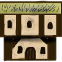
A house graphic for Nervonius.
Microsoft Paint-
MS Paint, although being a very simple program, can be used for more complex things. I will show you ways later on how to make graphics like the banner you saw before in paint. I started out in paint and made various pieces of art before I discovered Photoshop. In all truth, it is a good starting place, but you will certainly need to go to a program like GIMP (mentioned below) or Photoshop if you want to be a serious graphics creator.

This comic is probably as good as a basic paint artist can make something without an a lot of time (however, you could do one better with what I am going to teach you).
A good example of a .jpg made in MS Paint, it is blurry and cannot be easily edited in Paint or most programs. STAY AWAY FROM .JPG IN PAINT AT ALL COSTS.
GIMP-
Gimp is GREAT for moderate artists or artists who want the same thing as Photoshop without the cost. Although I mainly use PSCS4 and its predecessor, Photoshop Elements 5, I have worked with GIMP and found it a sturdy and reliable program for doing most of the things that Photoshop can do. If you are working on MS Paint, I urge you to learn the ropes of GIMP as soon as possible for the sake of your art. I don't have any examples for GIMP because I don't normally use it, but I can tell you that most GOOD art done on a computer that is NOT done with a 'Pay-to-draw' program like Photoshop is most likely done with GIMP or other like programs.
By the way, I usually call GIMP 'Photoshop's Little Brother'. It really is a good program.
Seashore and Other Programs-
I can assure you there are other useful programs out there like Seashore and ones that are just as powerful as GIMP and Photoshop, but I have not tried those out. If you want me to test a program for you (it must be free/have a trial download), I will gladly do so.
Alternative Programs-
There are also many programs you can use that are not called drawing programs, Adobe Flash CS4 being one, another could be pretty much any program where you have a pen tool available to you. The picture you saw above for 'Comical Style' was done on Flash... here is another one:

(c) 2010 by Samulis
How to Select the Best Program
Question time: What do you want to do with your image program?
Here are some answers and what you should get:
A. Make a few very basic pictures with basic shading- get Paint or similar low-powered program.
A. Make a lot of medium-high quality pictures with lots of changes and shading and... - get GIMP or similar higher powered program, such as Photoshop Elements.
A. Make a lot of extremely high quality pictures with lots of layers and manipulations and filters... - get Photoshop CS4 or Elements or a similar PAY-TO-DRAW program.
-------------
I bolded answer two, that one is probably the most applicable to most of you. Answer one is for if you are probably just a programmer or if you are content with the graphics from the program or ones that someone else made for you.
If you want to go the extra mile and do answer 3, good for you, you're ready for the industry, but that doesn't mean you're in it yet... once you mow a few dozen lawns or work a few weeks to pay off the purchase, you'll be ready to begin. Only go the extra mile if you can... and be warned, effects can often make the 'invisible' pixels go funky when imported into programs like Paint.
How to Make it Look Like You 'Went the Extra Mile'
With GIMP and Photoshop, you have two very powerful sets of tools at your finger tips for drawing either type of style (Realistic vs. Comical). For realistic, you have the dodge and burn tool, the paintbrush tool (if used with association with the 'shift' key to make straight lines), the healing brush tool, and a number of filters and brush styles to give you the best possible picture. GIMP also has their own dodge and burn tool and the paintbrush tool, along with their own healing brush and a number of simple filters. Here's a quick picture that could be done with either program and a bit of detail on how it was done:
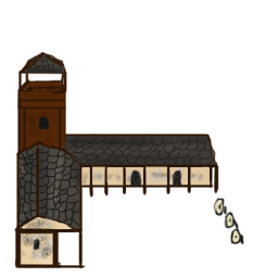
I started by drawing the framework in brown then going over it again and again to 'fortify' the lines. Then, I did the roof.
The roof was done with the base color (a medium gray) then the dodge and burn tools were used to give that look of shading and gradients. Lastly for the roof, I added in the fake edges of the natural stones.
The walls were next. I put on a plain peach/skin-tone color and then used a rough brush with an opacity of 60% to lightly 'dab' on the wear and tear on the stucco. Lastly, to finish the work, I used the sponge tool on 'desaturate' to 'draw out' the color in areas to make it look more worn.
The tower follows the same thing as the roof, but without the lines being drawn in at the end. The doors and windows went in last, just a brush going around on an opacity of 90%.
---------
If you don't know what half those words are, that's okay. It just means you aren't a photoshopaholic like me. ;)
For GIMP and Photoshop, you should be familiar with these terms:
Color, Opacity (The opposite of Transparency), Brush, Dodge (it makes things lighter looking), Burn (it makes things darker looking), Saturate (the process of making colors more vivid), Desaturate (the process of making colors less vivid), Shading (the process of applying light to a two dimensional image), Gradient (basically when you take two colors from the color wheel and it puts out those colors at opposite ends and every color in between).
For Paint, you probably only know these:
Color, Brush, Gradient, Shading.
Well, maybe only Color and Brush, but at the very least, you must have heard of Shading and gradient at some point in your life...
In Paint, you are working with the bare minimum in editing tools. You have selection tools, 6 brushes, a text tool, a line tool, and a shape tool... and that's about it. To make up for that, you have to know your color wheel cold. You need to understand the art of light and how it affects shapes and materials. If you go around using pre-made gradients or none at all and call it 'Realistic art', no one will believe you.
Flag/Banner Tutorial
So, let's make a banner in Paint. If you have GIMP or Photoshop, this part may appeal to you anyway, and I will have (in italics) the steps for GIMP/Photoshop.
First, open up the program and go into Image, then attributes and change the file so that is 64 pixels tall and 32 pixels wide.
(Open up Photoshop/GIMP, file>new, type in attributes: 64 pixels high, 32 wide, in GIMP, hit 'Advanced Options' and have background filled with Transparency (optional). In PS, click file>new, type in attributes, and then have background filled with transparency (optional), MAKE SURE THE COLOR SETTINGS ARE RBG, 8-BIT.)
Zoom in to 400% (view>zoom>custom>400%).
(GIMP: in the drop-down menu at the bottom of the editing canvas screen that shows a 100%, bring that 100 to 400%) (PS Elements 5: use the scroll in the middle of your mouse; PSCS4: In the box in the top-rightish of the screen that shows a 100%, type in 400 and hit the enter key).
Now, with the pen tool (the smallest circle or smallest square, don't use the pencil tool... you can't see what you are doing) or rectangle tool , draw a rectangle that takes up the center of the picture and fill it in, like this...
![]()
(same for both programs, in PS, make sure the hardness of the brush/drawing is at 100% hardness, and in both, use a 2px/3px brush size. Fill using paint bucket tool... then go over on the inside of the lines in PS to make sure there is no transparency in the box).
Cut away at the sides of your flag to make it look like this using the paintbrush on the smallest circle painting white...
![]()
(use the eraser tool on the other two programs)
Now, do something I call 'seeing the light'. Look at the flag and see where it is closer and further if it were 3D. I see the part to the left as closer. If a part is closer, it is more in the light than if it is further (since it is closer to parallel to the light source, which is up). If it is further, it is also in the shadows, so it is darker. With the smallest circle in the paintbrush arsenal, draw lines of slightly darker reds as it goes to the right. When it gets to the furthest right, STOP GOING DARKER. Also, at the top (but not completely) have a few bands of lighter reds. Don't make it perfectly straight... you want it to be slightly 'interwoven'.
Select a darker red by going colors>edit colors>define custom colors and moving the little arrow down the bar to the right a tiny bit. Your flag should now look like this (hopefully)...
![]()
(In both programs, use the burn (exposure: 20%) tool as it goes 'back' and the dodge (exposure: 20%) tool as it comes 'forward' in the manner prescribed above, don't paint it like above, just use the burn and dodge)
Now draw on your symbol with shading in mind... get darker where the red gets darker and lighter where the red gets lighter. Congrats, believe it or not, but you are done! You may want to add a beam above the flag or a pole to mount it on. Just take your paint can, go to the custom color editor, and make the red and blue color at 255 and the green at 0 and the program will select pure purple/pink. Just click your can over the white and it will take care of the rest for you. Publish that and it can be imported as a custom graphic that covers two squares in your game...
![]()
(In both programs, try drawing the symbol on a separate layer and then just applying the burn/dodge on that symbol, then merge the layers and publish. If you want to bring your resource onto the website, you will need to go back and change the transparency to color ff00ff. I did it using the magic selection tool and then I went around my edges with the pencil tool)
GIMP Finished:
![]()
PSCS4 Finished (notice little bits of semi-transparent red? use that eraser like there's not tommarow and make sure you get 'em all):
![]()
If you have any questions about the above tutorial, send me a private message or an e-mail (samulis@live.com).
Conclusion
It's all your decison!
What you do and need to get done with your art is all your choice. You can do anything you want with art programs, and don't let anyone tell you that your art sucks. If they do, go back to the drawing board and TRY AGAIN. The key to sucess in art is trying. If you put 10 minutes into a piece of art, it will never be as good as if you put an hour. Remember what you are trying to achieve with the art that you are making and remember what style you want to use. It is all very important.
And lastly, good luck!
-Samulis
Nota Bene: All art used in this tutorial is either the intellectual property of Samulis or his affiliates. Do not copy any image from this tutorial without permission. The creator gives full permission to the owner and moderators of this website and program to make use of the graphics included, and the text is for all to use. Please send Samulis a message if this tutorial confuses you or if a part is unclear or out of date. Thank you.