We’ve been hard at work getting City of the Shroud’s UI hooked up and looking good. There is still some polishing to be done, but we’re really proud of the results!
First, here is our new team menu UI in action:
I’ll go into more detail below, but before that, I’d like to show you our new-and-improved City Map:

What’s new here? First, the structure of the map means that it is far more screen ratio independent than it was before, so those of you with 16:10 screens (i.e., Mac laptops) will see improvements on that front.
The more obvious difference is that big old chart on the right: the Balance of Power. As you play through each chapter of CotS, the balance of power between factions will change, and that chart will show you the state of affairs at any given moment.
You’ll be able to see who you’re allied with as well as how powerful each faction is relative to the others for the current chapter (I put the Hat Merchant in the affiliated leader slot because I think he’s hilarious - not an option in the final game!).
As people play through the live chapter, those bars will fluctuate based on players’ choices until we lock the chapter’s balance of power in order to start writing the next one. Once the balance of power for a chapter is locked, the bars will show the final balance of power for that chapter until the next chapter is released. Once you start the next chapter, they’ll be moving again until we lock that one to write the next one, and so on. If you get your influence in early, who knows - your impact may end up influencing other players :)
We’ve also streamlined the experience by stripping out what we had originally called the “Main Menu” because we decided that the City Map could act as your hub - it’s how you interface with Iskendrun in the campaign, and by moving some functionality around, you can now go from the “Start” menu straight to the campaign screen with no features or accessibility lost.
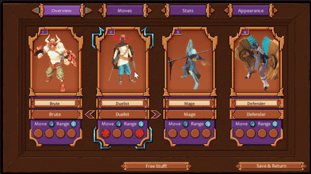
The other UI element we’ve been working on is the team management menu - the screen where you’ll set up your party, equip your Link Gems, configure your stats, and even equip different skins/mod items.
You saw it in GIF form above, so let’s break it down here, screen-by-screen:

The Overview panel shows your current team setup - the class, visual appearance, equipped Link Gems, name, and movement and attack ranges of each of your units.
Clicking on a character takes you to their Moves panel:

Here, you can review and equip the Link Gems you’ve acquired, read their descriptions, and try out how the Link Gems you’ve chosen string together using the Try! Button. There are shortcuts for the other panels, as well as the option to switch the currently selected character (and even their class) too.
Next up is the Stats screen:
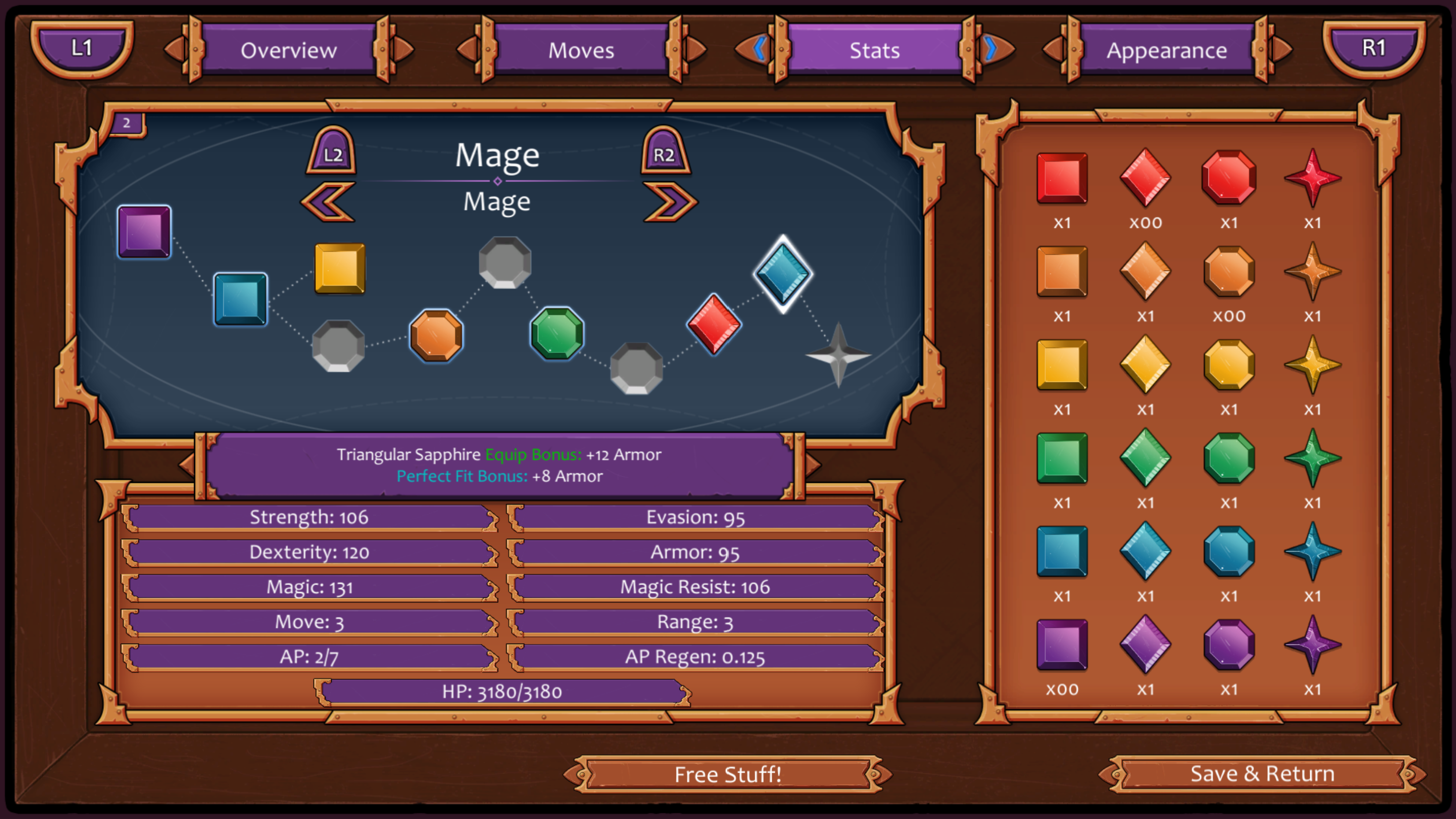
On this screen, you can see your full Stat Gem inventory, as well as the grid where you equip those gems for the selected unit’s current class. Descriptions of each stat are found below the grid, and the box in between the two explains either the selected gem or stat, depending on which you have highlighted.
Stat Gems that are granting your unit a Perfect Fit Bonus glow with a thin, blue line around the edges - notice that the yellow Square is not glowing, as it’s sitting on a non-square-shaped slot (also, the thick, white glow shows which gem you have selected).
If you put a Stat Gem into a slot it isn’t meant for, you gain the ordinary bonus but not the Perfect Fit Bonus. So if you want just have to have an extra HP bonus in exchange for losing a Perfect Fit Bonus, you can make it happen! Customize your unit to fit your playstyle - want a high-HP Mage that can take a few smacks from a Brute? The choice is yours!
Finally, we have the Appearance menu:

This menu lets you equip any skins or mods you’ve acquired. Simply cycle through, and you can view all the available options for a given slot. If you like what you see, you’re done! Just leave the settings as-is and you’re all set. The next time you use that unit in battle, they’ll appear just as they do here.
It’s a pretty big upgrade from the old menus, so let us know what you think!
So what’s next? We’ve got a bit more polishing to do on the menus before they’re totally final, but now that we’ve got this major UI update in, we’re turning our attention to the next big event: implementing Chapter 1.
The main content for Chapter 1 is written, all the environment assets are complete, and all of the components necessary to bring it to life are more or less ready and hooked up. So what goes into implementation? Mainly, that means getting the game text into our quest database and connecting them all together (clear Quest X >> unlock Quest Y). We’ll be putting together our battle maps for Chapter 1 as we go along too.
Stay tuned!
