With the look of Feeding Time's animals nailed down, it was time to move on to the backgrounds.
For our initial backdrop, we went with a living room as it nicely tied together all the typical household pets. It also let us use a carpet to cleanly delineate the numerous gameboard components.
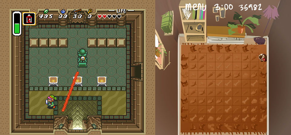
Our original sketch followed the perspective-bending approach of Zelda: A Link to the Past.
While our first mockup tried to match the four angles at which the animals faced the gameboard, direction ceased to be a concern when we decided to present each animal from just a single side.
This allowed us a bit more freedom, but the lack of a clear and consistent perspective also bred confusion. Were the animals stacked on top of each other, or being viewed from above?
The background lost a certain sense of being a real place, but Abel suggested we roll with it. To prove his point, he showed us how well Hanna Barbera's skewed and uneven backgrounds worked in various old cartoons.
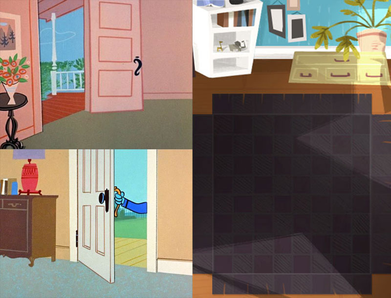
Top-left and bottom-left: Hanna Barbera's skewed and uneven backgrounds.
Right: Feeding Time's indoors background inspired by the style.
We agreed, and were quite pleased with George's first crack at the style. However, in the end we abandoned the indoor environment itself.
The reason was a desire to keep the areas consistent, and constraining them to interiors was too limiting and had some negative associations with confinement. Instead, we went with a suburban backyard for the "pet zone" and kept the other biomes to the great outdoors.
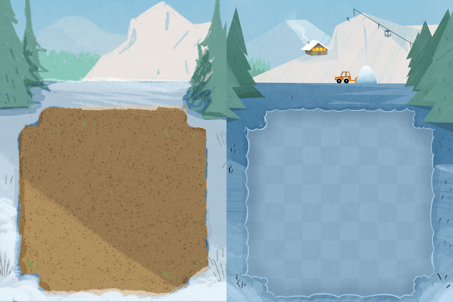 The initial rough of the tundra zone and its finished version.
We also wanted to organically duplicate the carpet's natural grid for all the areas, but this proved very difficult.
The backyard was a natural fit for a checkered pattern akin to the turf of various sports field, but the safari and tundra zones were trickier. We experimented with rows and columns of cracks in a dry bedrock and an arrangement of sticks and twigs, but neither proved ideal. The extra decorations muddied the gameboard and took up too much space.
The issue of clarity proved substantial even when working with a grid that only had slight variations in surface pattern and lighting. Since easy recognition of the foods and animals was a crucial part of the game, we decided to keep the gameboard as uniform grids and only change their colour scheme to match each biome.
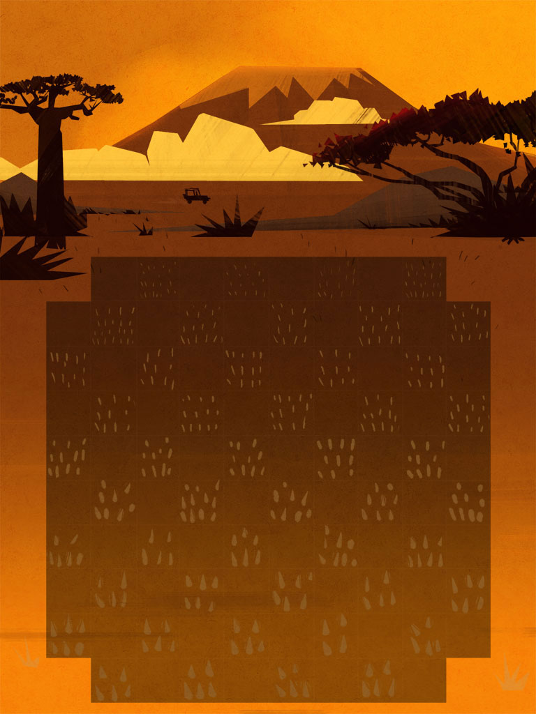
The grid of the original Safari zone consisted of grassy tufts that got progressively larger towards the bottom of the screen. Along with a light gradient, the design helped to create depth but was eventually removed to make the gameboard easier to parse.
In hindsight this was probably an issue we spent too much time debating by looking at the background illustrations themselves. As it turned out, the gameboard pieces covered too much of the grid to fret over its design, and the uniform shape actually fit the overall art style.
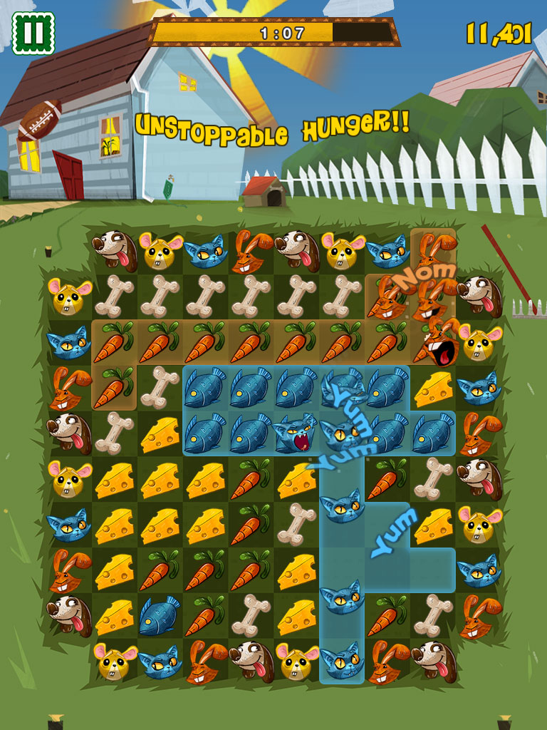
The football and various other background animations add a subtle sense of life
and don't overly distract the player.
To add some life and personality to the biomes we introduced various interactive Easter Eggs and tied them to in-game achievements. For example, the backyard zone was filled with elements that could activated with a tap: sprinklers let out bursts of water, the house door could be knocked on and its lights individually turned on and off, a football could be launched over the fence, etc.
While these were fun ideas, they had nothing to do with the core gameplay and actually detracted from it.
The player had to sporadically stop to click on random parts of the screen instead of focusing on matching the animals with their corresponding foods. Eventually we simply removed the interactive component and activated them based on a timer. It helped to make the areas feel alive, but the player didn't miss out on any gameplay by ignoring them.
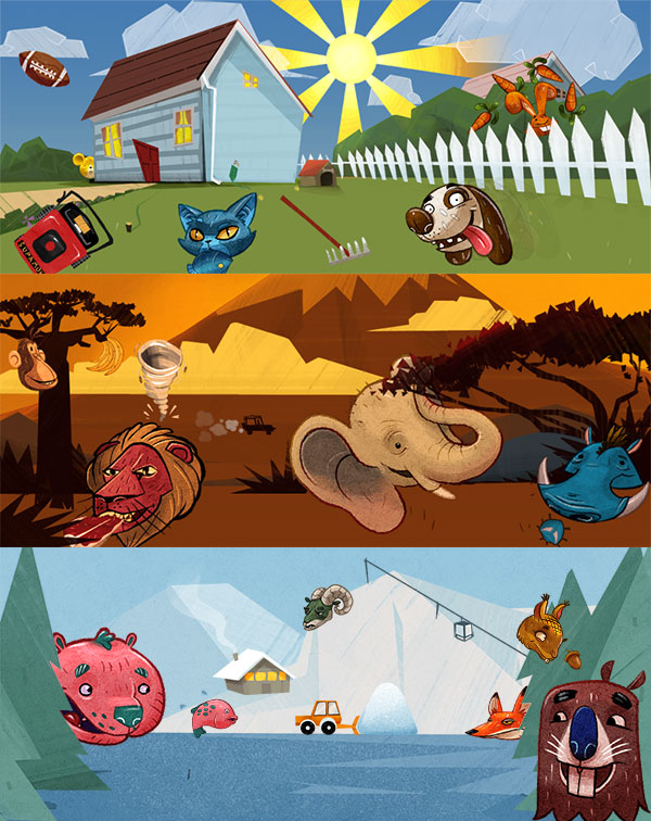
The finished tableaus of Feeding Time's main three zones.
One final aesthetic change we made towards the end of development was to turn all the clouds into food shapes.
Since each area was outdoors and included parallax-scrolling clouds, it suddenly hit us that we could "standardize" their shapes and velocities while adding a bit of whimsy to the game. This also helped out with the level transitions and other aspects of UI, but more on that next time!
