The DBolical sites have undergone a number of design changes over the years with the current design (v4) launching in 2008. A lot has changed in the past 7 years with mobile, adaptive and flat designs currently dominating. Whilst we haven't adopted any of this hype, we are exploring how we can deploy a smarter, easier-to-use design.
There are a number of big areas we are focusing on, with the primary being putting the important information within a profile first. This means download buttons, watch buttons, videos, key details to appear above the fold. Step one was to consolidate our gallery system from adding a lot of vertical height into a simple bar:
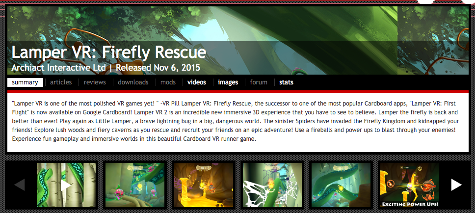
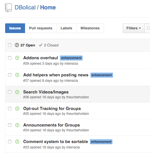
This removed a lot of vertical height and duplication (the same video sometimes appeared multiple times in a profile). We know this bar of images isn't the best as it is quite small, we will work to address that in a future update. There is more coming, and we've started a public Github page for our community to report bugs and suggestions. So if you have ideas for us, send them in. Hope you like the changes, more are on the way!


Will...sounds good
I have little idea "notice system"
Ex: Abc123 comment on your images,sr12 upvote your comment...etc
Would love if that were integrated into the updates section.
Possibly a option to turn that off and on too via profile options?
I like the header's but wish they could be improved, mainly a cosmetic request.
Just remove the transparent black bar behind the name and date the person joined.
Could also make it slightly bigger, instead of 950 by 150, rather 950 by 250, etc.
People who are really into profile customization would likely appreciate it.
Github...great. :)
Will use it right away!
I like this new layout but... you should also keep the old layout (slightly modified) and give people the option to choose in their settings.
My suggestion:
-Old layout.
Same as before but move the Video player to the top of the page, below or above the image gallery bar, whichever looks best.
-New Layout (current layout nov-12 2015).
Either no videos in the gallery or an option to show your video in the gallery bar.
-Possible Third option.
Same as the modified old layout only showing the latest image instead of a video.
I'm not a huge fan of the auto-play for videos now. Chances are you'll come back on a video to read the comments and you don't want to watch the video again.
Probably best to just not have the auto-play, or again, add an option in the profile settings.
I agree with you,the old layout is better....
Well, would like to see a hybrid option - the latest video on the page as it was before, but still with the new media list layout (both videos + images included there) at the top like it is now.
Against auto-play too. Breaks listening to music elsewhere, browsing through videos just to watch a particular one, etc etc.
I like that they have moved the "Profile" menu a bit down so that there is room for 6 windows instead of just 3. But I like that there are pictures, instead of video.
Also against auto-video playback.Whomever thought that would be great is an idiot! I am forced to use my 3G modem with a 1Gb cap sparingly atm as I can't connect online normally and the landline operator is not really interested in fixing the problem...
Actually, come to think of it, this is a terrible idea on my part.
While I don't think this update is going in the right direction either...
...Looking at what you're trying to do, that is making the site more accessible and simplifying the GUI... I think you need to "shift" the complexity of the site considerably.
One can already tell most people aren't going to be very happy losing site functionality, links on their profiles, etc.
So by "shift" I mean keeping all the features you already have, all the page layouts too, but working on a simpler and yet more powerful way for users to change what functions they have available to use.
I'm talking about simplifying the basic UI and search functions for new members and non-registered visitors, probably along the lines of what you were already planning, while allowing the members of the site that visit it regularly to customize, let's say "upgrade", their experience by essentially just having access to the site the way it always worked.
This means making a more complex and yet more understandable profile editing page with tabs for different options, html editors for description fields, the lot... and yet making sure that new members don't need to worry about all that when they first join the site.
So shifting the complexity of the site to where it belongs while keeping your current goals of simplicity and accessibility in mind.
Naturally this would also offer an excellent opportunity for you to add new advanced features like the image gallery and media library changes I proposed, without having to worry about adding unnecessary complexity for new users and visitors ;-)
Thanks for putting up with me spamming my ideas by the way.
Ultimately we would like to simplify the site, so perhaps creating an advanced customization page like you suggest allows the creators todo advanced things. Would the advanced customization page change how you see the site, or how people see the pages you customized?
A bit of both I suppose. In the settings you can customize your own overall user experience like enabling/disabling videos to auto-play for example.
In my mind there would also be a tab for customizing your profile, like with an html editor and setting different themes.
This would work similarly for game and group profiles. This would be visible to others.
The image ribbon that was there before should still be there just above this new videos ribbon.
And as I have suggested before, I think there should be the same thing like this but for mods, games, addons, and downloads, as this is all important information and it should all be right on the front page of someone's group, company, or user profile.
The stuff they are working on? That is planned.
I do not like this!! Videos should not be in the image section they should be seperate would be much better if you make a video section like the image section just below it. Else yes let people choose which layout is better for them.
They are still separate, it is just the first 2 videos that are shown
Initially it felt weird, but now it doesn't as much. It removes the most recent video from the main page (which I never used) and it is still pretty much the same as before (just a little bigger to the side to have space for 2 videos and an extra image).
Something tells me that having 2 bars (one for images and the other for videos) would clutter the main page.
Maybe we could take it the way it is now and "split" them, that way we will have 2 previews of videos and right beside them, the image bar. Wish i could explain it better, it looks good in my head. xD
I agree with Admiral_Skeybar, remove auto-play.
And please, never adopt those hypes.
One little bug report: If you have an image on HD view and you go to another this happens: Moddb.com And when you go back to SD view: Moddb.com
It's no big deal, you just need to reload the page after going back to SD, just letting you guys know.
That bug should be fixed now
I heavily dislike how videos are now mushed together with images. it was already quite uncomfortable to navigate the gallery but now even more.
The staple of my profile is now downgraded and obscured. I don't fancy that.
You have to edit your profile codes again, same thing I'm facing, only I am too lazy to go through that again :v
Isn't there any way to restore the "HD view" option ? it was way helpful and much detailed.
It got fixed already =D