Hello there, indieDB folks !
It's been a while since my last article.
In these last few days, I've been trying to crack what I could do to improve the art on my game. The way I see it, art is one of the main ways new costumers'd like to download your product. Since very young, I used to draw and paint. Never been too formidable at that - admittedly...
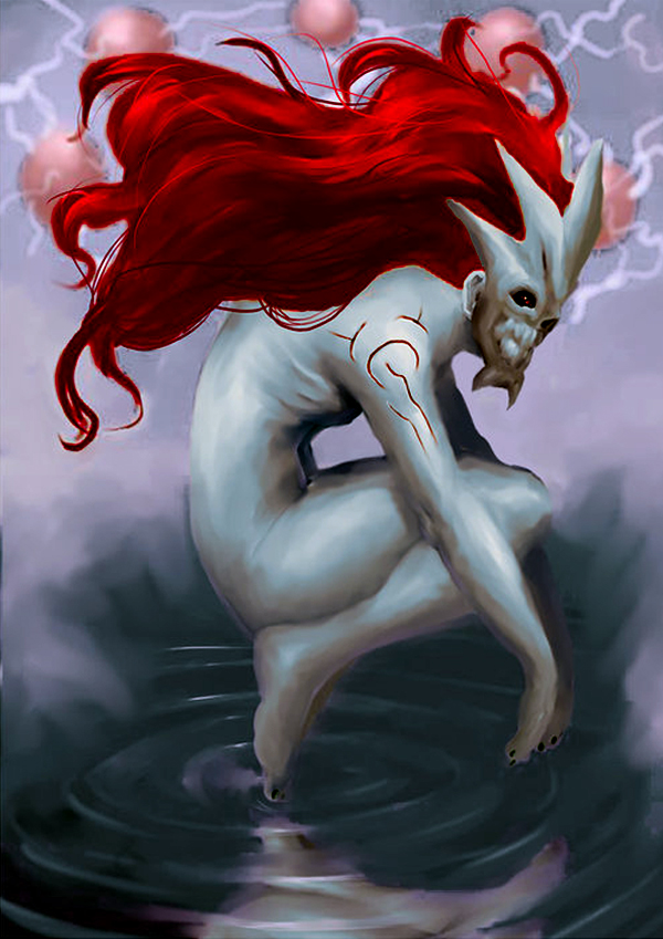
that, below, is one of my old drawings. I don't think it is particularly bad, but it's definately not THAT good. Not conceptart.org good.
But making a game is VERY different from making a drawing... To begin with, a drawing is a static composition... Which means it's easier to arrange elements and make it look kinda beautiful. In a game, however, things are moving !
To make art such as that drawing you've seen earlier, one'd need to bear in mind the disposition of elements in space and their colors, mainly. It'd be useful to know a little bit about color theory elements, such as complementary colors and such.
How do you arrange elements in space when they are moving, and more, when their movements are (mostly) determined by player actions - which is another human being, that does not necessarily behaves as you'd expect??
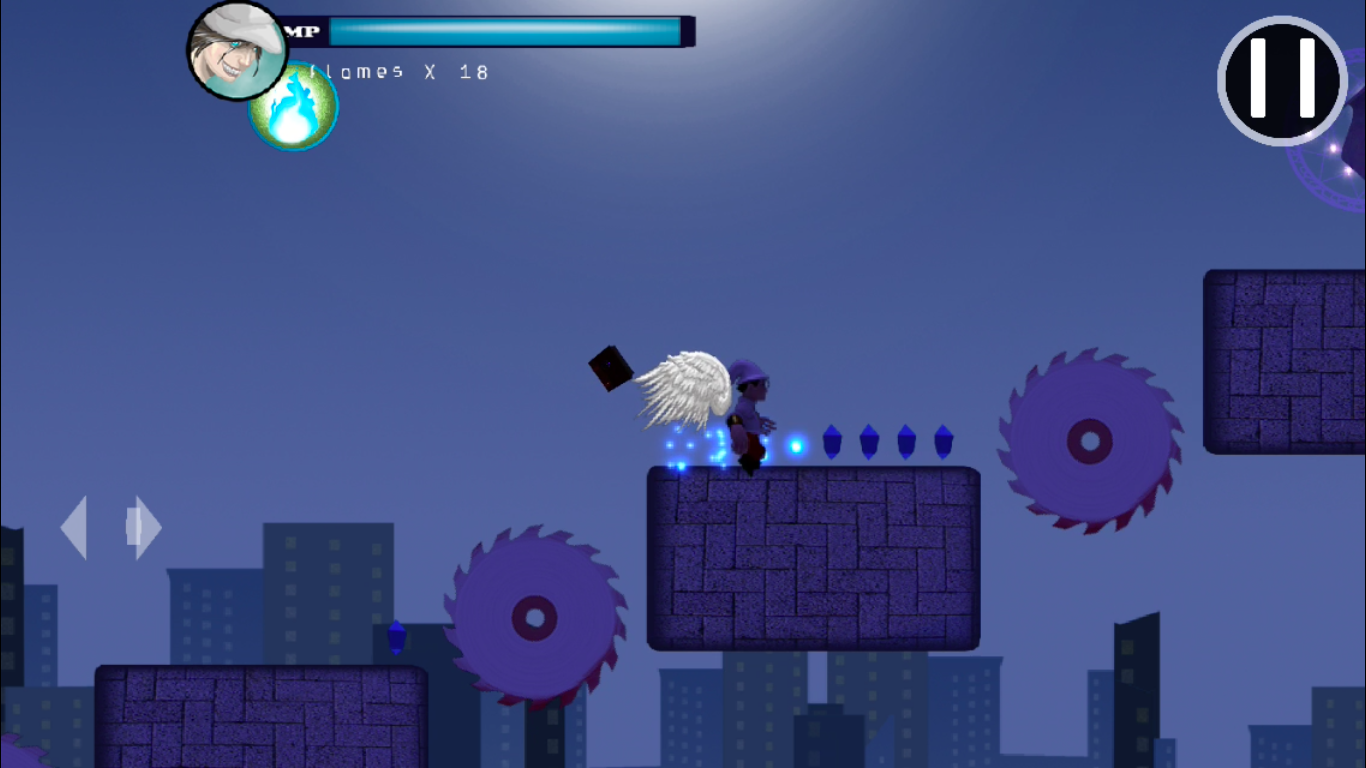
Here is one of my old screenshots, to exemplify what I am about to say :
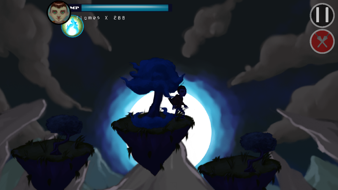
now, look at a new one :
I've changed quite a bit of things between one and the other. To begin with, most objects - and that inlcudes the background itself- have been repainted. I even re-did the main character.
I believe the key to arrange the elements in space in conditions such as those in a game are to create some sort of anticipation of player's movement. The disposition of elements guides the player and induces him/her to move according to a plan - a master layout through which things look and feel better.
this new background is composed of rocks and clouds that point to a shining object - the moon- and kinda do more than that. They all point to the player, keeping the player's "body" in focus, as such :
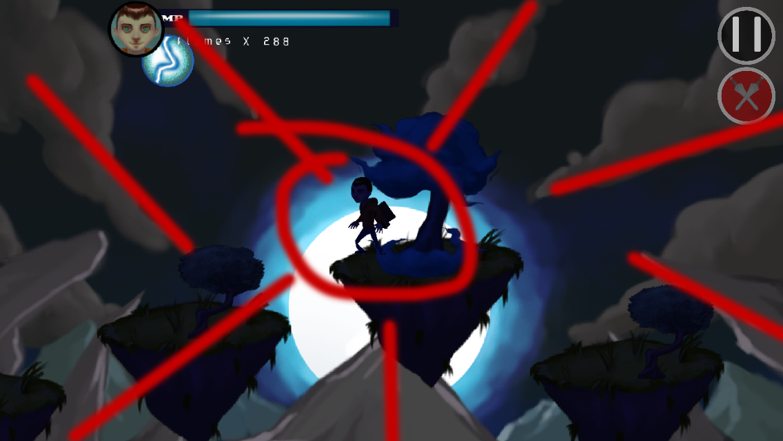
Also, observe the colors in this screenshot.
There are only a few ways to achieve the sense of a good color composition, and those'd be, mainly :
- by contrast
- by harmony
This composition uses harmony, keeping mostly tones of blue (or blue-ish) colors in all elements. Even things that are not blue... by the disposition of elements, even though their colors are close to blue, they are not perceived - by the human eyes and brain - as blue. Take the grass on those floating platforms, for instance.
It looks like green, even though it's kinda blue (at least very blue-ish).
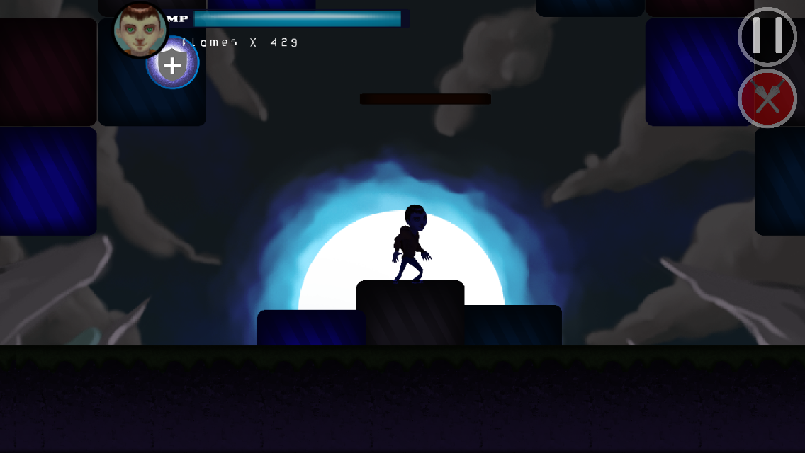
Here, below, is a sample of the "green" color in the grass.

Outside a blue harmonic composition, it looks very different, doesn't it ?
Hope you guys enjoy this article :)
Here is a gameplay video of the game :