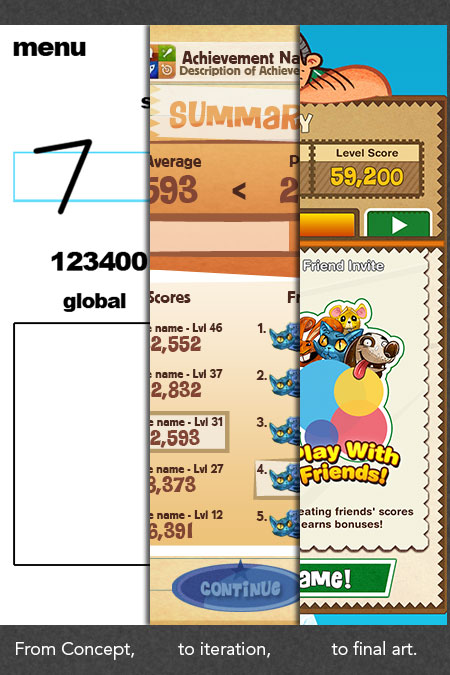
The evolution of the Feeding Time interface.
Feeding Time's interface was one of many components of the game that went through continuous iteration along its development. The overall theme revolved around traveling the world and delivering food to hungry animals, but the style it was presented in changed several times over.
Through this article we will be taking a look at how the UI evolved from a bunch of scribbles to a fully fleshed out interface that complemented our in-game art.
Two of the original motifs we used for Feeding Time's UI.
Among the first interface ideas we had were a passport and some luggage that went together with the traveling theme of the game. While these motifs were eventually scrapped we did take away some lessons from them. For example, the passport brought along with it a very negative bureaucratic association; its drab colours clearly something to avoid in an otherwise joyful game.
In contrast to the cold rigidity of the passport, the briefcase motif was a lot more fun and we took some of the colouring and texturing from it for future use. The object itself however brought with it certain challenges.
Opening up a briefcase-menu might be fun at first, but by the twenty-seventh time it loses its charm and becomes a time-consuming chore. Its overall shape also limited us on the dimensions of the menus and made pop-ups much trickier to implement.
Another minor strike against the briefcase was that we didn't want to limit ourselves only to locales that it made sense to bring luggage to, i.e., if we wanted to create an underwater level, bringing a suitcase might seem a bit odd.
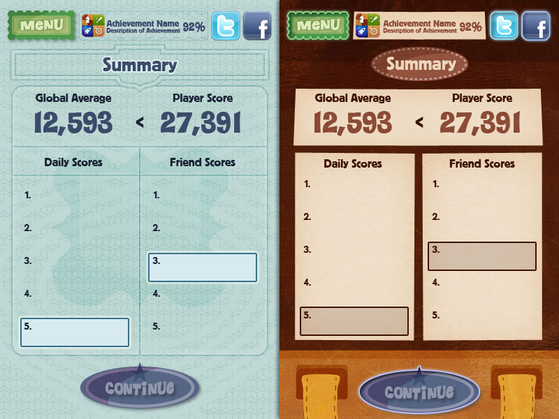
The scrapbook and restaurant menu motifs each brought elements that we refined and used in the final design.
Our next mockups involved a scrapbook theme that brought with it a very arts and crafts feel, which suited the overall tone of the game, and a restaurant menu that helped to define how we framed and organized our information.
These were also the first iterations that began to prominently use patterns, and their texturing was a closer match for the graininess of the foods and animals. The scrapbook used too much real-estate due to its irregular components, though, and the restaurant menu proved a bit too formal.
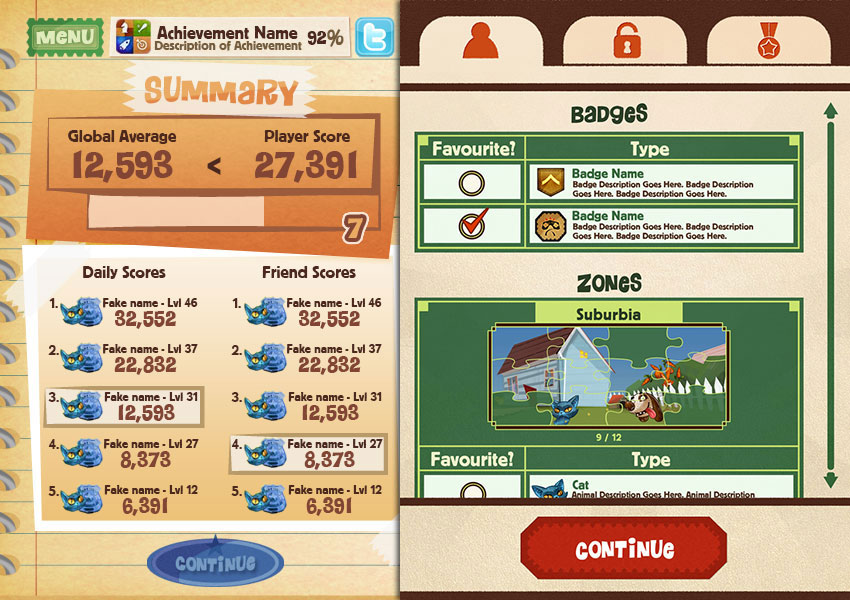
The final style began coming together with the clipboard motif.
Another idea we tried out revolved around a delivery person with a little clipboard that kept track of all the areas the player visited with their food-packages. We used what we learned from the previous revisions to inject a little fun in the form of patterned borders and colourful textured icons and buttons.
Looking back on this iteration we can still see parts of it that survived into the final cut, however this screen still lacked a bit of personality.
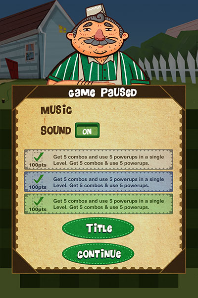
A more lightweight menu with our friend the store clerk mixed in.
To add more character to the UI we decided to include the clerk himself as something of a mascot, peering over the menus and offering encouragement. This required a lot of cuts to the amount of space the menus used, but the end result was well worth it.
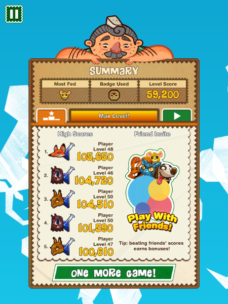
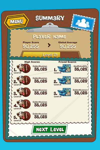
Final art for the summary screen.
With the clerk firmly in place, we combined the rough colouring of the briefcase, the symmetrical framing of the restaurant menu, the patterns and borders of the scrapbook, and the checking-in motif of the clipboard. These made for a more abstract, papercraft-like design, but one that fit the overall game while facilitating the appearance of the clerk and exposing the game's colourful backgrounds.
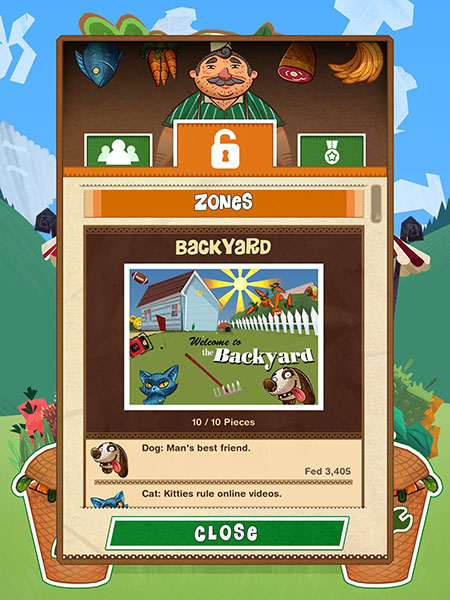
Final art for one of the profile menus.
All of these changes led us to the final style above. We made some small tweaks along the way and polished the graphics and the user flow as best as we could. With Feeding Time now out on the AppStore, we hope that all of our efforts have paid off and you check out the finished product!
